Did you know the right interior design color schemes can change your living space’s feel? The newest home interior color trends focus on making spaces cozy and welcoming.
Now, we’re seeing more of rich, warm colors like burgundy and green. Earthy tones are also popular for simple designs. These color trends aim to make our homes feel comfortable and peaceful.
Exploring interior colors can help us make our homes stand out. Whether you want to make a bold statement or a quiet space, the right colors are key.
Key Takeaways
- Rich, warming shades are trending in interior design.
- Grounding earth tones are perfect for minimalist schemes.
- The right colors can create a sense of comfort and well-being.
- Bold statements can be made with the hottest hues of the season.
- Calming retreats can be created with the right interior colors.
Understanding the Impact of Color on Home Interiors
Colors play a big role in making our homes feel right. The colors we pick can change how we feel and act. They can even affect our happiness and health.
The Psychology of Color
Colors do more than just look good; they affect our feelings and mood. Warm colors like red, orange, and yellow bring energy and excitement. They’re great for places where we like to chat and be active, like living rooms and kitchens.
Cool colors like blue, green, and purple make us feel calm and relaxed. These colors are best for bedrooms and bathrooms, where we want to unwind.
How Color Affects Mood
Colors have a big impact on how we feel at home. Different colors can make us feel different ways. For example:
- Red can make our heart beat faster and make us hungry, perfect for dining areas.
- Blue helps us relax and feel less stressed, great for bedrooms.
- Green connects us to nature and brings balance, ideal for any room.
Knowing how colors affect us helps us choose the right colors for our homes. This way, we can pick colors that match our needs and tastes.
Choosing Colors Based on Room Function
Choosing colors for our homes depends on what each room is for. Different rooms need different colors. For example:
- Kitchens and dining areas need warm colors to make us hungry and talkative.
- Bedrooms and bathrooms should have cool colors to help us relax and sleep well.
- Living rooms and play areas can mix warm and cool colors for a lively feel.
Keeping up with interior color trends helps us pick modern and stylish colors for our homes.
Trending Interior Colors for 2023
This year, homeowners have many trendy color options. These include earthy tones, bold statements, and timeless neutrals. The focus is on mixing nature-inspired colors with vibrant accents for a balanced look.
The Rise of Earthy Tones
Earthy tones are big in 2023, adding warmth and coziness to homes. Colors like terracotta, sienna, and moss green are favorites. They connect us to nature and are great for living rooms, dining areas, and bedrooms.
Bold Accents: Bright Colors to Consider
Bold accents are perfect for making a statement. Bright colors like coral, turquoise, and sunny yellow add personality. They can highlight a room’s feature or furniture.
To use bold colors well, pair them with neutral backgrounds. This contrast makes the bright colors pop without overwhelming the space.
Timeless Neutrals Still in Vogue
Timeless neutrals are still a favorite in home decor. Shades of white, beige, and gray are versatile and elegant. They work with many styles, from modern to traditional.
Neutrals are great in small spaces, making them feel open and airy. They also let you easily change your decor without repainting.
Popular Color Palettes for Every Room
Different rooms in your home need different colors to look and feel their best. Think about what you want each space to be like when picking colors.
Kitchen Color Trends
The kitchen is the heart of the home. The colors you choose can make it feel warm and welcoming. Bold and vibrant colors like deep reds and rich yellows bring energy. For a calm vibe, try soft whites, creamy beiges, or soothing blues.
Living Room Combinations
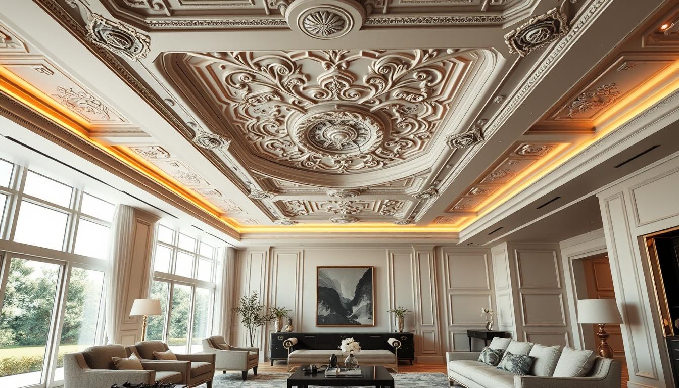
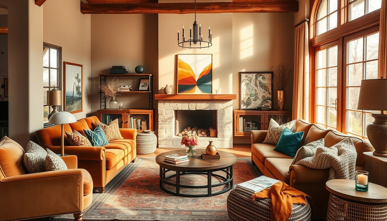
The living room is for relaxing and entertaining. Choose colors that make it feel cozy and inviting. Neutral tones like beiges, grays, and taupes are classic and calm. Add earth tones or blues for a cozy feel.
Bedroom Sanctuary Colors
Your bedroom should be a peaceful retreat. Soothing and calming colors like soft blues, pale greens, and gentle lavenders are perfect. Use warm neutrals like caramel or honey for a cozy, safe feel.
Bathroom Bliss: Soothing Shades
Bathrooms should feel calm and refreshing, like a spa. Soft whites, creams, and pale blues are great for this. For luxury, try deep greens or rich woods for warmth and elegance.
Choosing the right colors for each room can make your home more beautiful and functional. It creates a space that feels welcoming and harmonious.
Painting Tips for a Flawless Finish
Getting a perfect finish when painting your home’s interior is more than just picking a color. It’s about preparation, the right techniques, and knowing the paint finishes.
Choosing the Right Paint Finish
The paint finish greatly affects a room’s look and feel. Each finish has its own purpose, from durability to beauty.
| Finish Type | Description | Best Used For |
|---|---|---|
| Flat/Matte | Non-reflective, hides imperfections | Low-traffic areas, ceilings |
| Eggshell | Slight sheen, durable | Living rooms, bedrooms |
| Satin | Soft sheen, easy to clean | Kitchens, bathrooms, trim |
| Gloss | Highly reflective, very durable | Doors, trim, high-traffic areas |
For more detailed guidance on selecting the perfect paint finish, consider visiting our DIY interior painting tips resource.
Prepping Walls: What You Need to Know
Proper wall preparation is key for a smooth paint job. This includes cleaning, fixing holes or cracks, and sanding for better adhesion.
- Clean walls with soap and water to remove dirt and grime.
- Use spackling compound to fill holes and cracks, then sand smooth.
- Remove old paint and wallpaper if necessary, and sand the surface.
Effective Techniques for Application
The way you apply paint greatly affects the result. Using the right brush or roller, working in sections, and applying thin coats can help achieve a professional finish.
By following these painting tips and techniques, you can get a flawless finish that enhances your home’s interior. Remember, the key to a successful paint job is in preparation, the right materials, and patience.
The Role of Accent Walls in Home Design
Accent walls are a powerful design tool. They can turn a simple room into a stunning space. By focusing on one wall, we create a focal point that draws the eye and adds depth.
Creating a Focal Point
An accent wall acts as a visual anchor. It directs attention to a specific area of the room. This is very useful in open-plan spaces where defining areas is key.
To make a good focal point, think about the room’s layout and how people move through it. The accent wall should be the first thing you see when you enter the room.
- Choose a wall that naturally draws attention, such as the one behind a fireplace or a large piece of furniture.
- Consider the color and texture of the wall to ensure it complements the surrounding decor.
Best Colors for Accent Walls
Picking the right color for an accent wall is important. The color should contrast with the other walls but still match the overall color scheme.
| Room Type | Recommended Colors |
|---|---|
| Living Room | Deep blues, rich greens |
| Bedroom | Soft grays, warm beiges |
| Kitchen | Bold reds, vibrant yellows |
Tips for Painting an Accent Wall
Painting an accent wall can be a simple DIY project if done right. Here are some tips for a professional finish:
- Prepare the wall by cleaning and sanding it to create a smooth surface.
- Use painter’s tape to mask off the surrounding areas and ensure crisp, clean lines.
- Apply a primer if the wall has a glossy finish or if the paint you’re using is significantly different from the original color.
By following these guidelines, we can use accent walls to improve our home’s interior design. We can create spaces that are both beautiful and functional.
Incorporating Color with Decor
Color is key in home decor, shaping the mood and look of a room. By carefully adding color through decor, you can make your home welcoming and balanced.
Using Accessories to Add Color
Accessories are great for bringing color into your home. Things like vases, throw pillows, and rugs can add bright colors and personality. Pick accessories that match your room’s color scheme.
If your room is mostly neutral, add color with bold vases or patterned pillows. This can really make a room pop.

- Deep blues and greens for a calming effect
- Vibrant yellows and oranges for a cheerful vibe
- Rich reds and purples for a luxurious feel
Fabrics and Textiles: Color Choices
Fabrics and textiles are also great for adding color. Use upholstery, curtains, and bedding to introduce new colors or enhance existing ones. Think about both the color and texture to match your space.
A bold, patterned fabric can be the room’s centerpiece. A soft, muted fabric can add warmth and coziness. Some popular choices include:
- Velvet for a luxurious feel
- Linen for a natural, airy texture
- Cotton for versatility and comfort
Artwork as a Color Statement
Artwork is a powerful way to add color and personality to your home. A standout piece can change a room, catching the eye and starting conversations. Choose artwork that complements or contrasts with your decor’s colors.
Artwork can also tie together different colors and elements in a room. Whether you like bold, abstract art or more subtle, realistic pieces, there’s something for everyone.
By using accessories, fabrics, and artwork, you can create a rich, layered look. This reflects your style and improves your home’s atmosphere. These home decor color ideas can help you refresh your space with the popular home interior colors of the season.
Color Selection for Small Spaces
In small rooms, picking the right color is key. It can make the space feel cramped or open. Think about how color affects the room’s size when decorating.
Tricks to Make Small Rooms Feel Larger
Using light colors on walls is a great way to make small rooms look bigger. Light colors reflect light, making the room seem more spacious. A monochromatic color scheme also helps by creating a sense of continuity.
To avoid making a small room feel cramped, minimize clutter and keep things tidy. Using furniture that serves more than one purpose can also help keep the room feeling open.
| Color Technique | Description | Effect |
|---|---|---|
| Light Colors | Using light shades on walls | Makes the room appear larger |
| Monochromatic Scheme | Using different shades of the same color | Creates a sense of continuity |
| Minimal Clutter | Keeping the room tidy and clutter-free | Enhances the feeling of space |
Light Colors vs. Dark Colors
For small spaces, light colors are usually better as they make the room feel airy. But, dark colors can add depth and coziness as accent colors.
The type of lighting also changes how colors look. Natural light can make colors seem different than artificial light.
Using Mirrors to Enhance Color
Mirrors are great for making small spaces look better. Place mirrors opposite windows to reflect light and make the room brighter. Mirrors can also make the room seem larger by reflecting the color scheme.
When using mirrors, pick a frame color that matches the room’s color scheme. This will enhance the overall look.
Seasonal Color Changes: Refreshing Your Home
Every season brings a chance to update your home’s colors. Fall and spring are great times to add new hues and themes. Refresh your space with trendy colors that match the season.
Fall Color Inspiration
Fall brings cozy warmth and deep colors. Think about using earthy tones like olive green, terracotta, and golden brown. Use these colors for accent walls, throw pillows, and blankets. For a big change, update your home’s outside colors to match the fall leaves.
Spring Refresh: Light and Airy Colors
Spring is the time to brighten up your home. Soft pastels, whites, and creams can make it feel welcoming. Paint a room or get new furniture in light, spring colors. For more ideas, check out our services page.
Holiday Themes: Festive Color Ideas
Holiday seasons are perfect for playing with colors. Christmas calls for reds and greens, while Halloween is all about bold blacks and oranges. Easter brings pastels, and the Fourth of July is for red, white, and blue. Use these colors in decorations, table settings, and even temporary paint jobs.
| Season | Color Palette | Decor Ideas |
|---|---|---|
| Fall | Earth tones, olive green, terracotta | Accent walls, throw pillows, blankets |
| Spring | Soft pastels, whites, creams | Light furniture, new paint |
| Christmas | Reds, greens | Decorations, wreaths |
| Halloween | Blacks, oranges | Temporary paint, decorations |
Exploring the World of Color Theory
Color theory helps us create beautiful and useful interior designs. It’s about mixing colors in a way that looks good and works well together. This theory shows how colors interact and can be combined.
Learning about color theory helps us choose colors wisely for our homes. It’s not just about picking colors we like. It’s about creating a color scheme that makes our homes look and feel better.
Understanding Color Wheel Basics
The color wheel is key in color theory. It shows how colors are connected. It has primary colors (red, yellow, blue), secondary colors (orange, green, violet), and tertiary colors (mixes of primary and secondary).

The color wheel teaches us about color harmony. This is important for making our homes look good. By knowing the color wheel, we can find colors that go well together.
Complementary vs. Analogous Colors
Color theory talks about complementary and analogous colors. Complementary colors are opposite each other on the color wheel, like blue and orange. They make each other look brighter.
Analogous colors are next to each other on the color wheel, like blue, green, and yellow. They blend smoothly and create a unified look in our homes.
| Color Type | Description | Example |
|---|---|---|
| Complementary Colors | Colors opposite each other on the color wheel | Blue and Orange |
| Analogous Colors | Colors next to each other on the color wheel | Blue, Green, Yellow |
Impact of Warm and Cool Colors
Colors can be warm or cool, changing how a room feels. Warm colors like red, orange, and yellow make a room cozy.
“Warm colors can stimulate the senses and create a welcoming atmosphere, while cool colors can calm the mind and promote relaxation.”
Cool colors like blue, green, and violet calm us down and make rooms feel bigger. Knowing how warm and cool colors affect us is key to setting the right mood in our homes.
By using color theory, we can design homes that are not only beautiful but also functional and welcoming.
The Importance of Lighting in Color Perception
Lighting is key in how we see colors at home. The kind of light used can change how colors look. So, it’s important to know how it affects choosing interior paint colors.
Natural Light vs. Artificial Light
Natural light and artificial light affect color differently. Natural light shows colors as they really are. But, it changes from soft morning to harsh midday sun.
Artificial light, like incandescent, fluorescent, and LED, can be controlled. Yet, each type changes colors in its own way.
How Light Type Affects Color
The type of light can greatly change color appearance. Warm light makes warm colors pop, while cool light brightens cool colors. It’s key to test colors under different lights to see how they look all day.
For more on how paint colors change with light, check out TCPI’s guide.
Choosing the Right Lighting for Your Space
When picking lighting, think about the room’s purpose and color scheme. Use lights that match the colors you want to highlight. Here’s a simple guide:
| Room Type | Recommended Lighting Type | Effect on Colors |
|---|---|---|
| Living Room | Warm LED | Enhances warm tones |
| Kitchen | Bright White LED | Makes colors appear vivid |
| Bedroom | Soft Incandescent | Creates a cozy atmosphere |
Knowing how lighting affects color helps in picking the right home decor color ideas and choosing interior paint colors. This way, your space looks great under any light.
Sustainable and Eco-Friendly Color Choices
More people are choosing sustainable colors for their homes. This is because of growing concerns about the environment. The colors we pick play a big role in making our homes greener.
Non-Toxic Paint Options
Choosing non-toxic paints is a big step towards green design. Traditional paints can harm our air quality. Now, we have eco-friendly paints that don’t release harmful chemicals.
Some top brands for non-toxic paints include:
- Benjamin Moore’s Natura: Known for its low-VOC and zero-VOC options.
- Behr’s Premium Plus ULTRA: Offers low-VOC paints with a wide range of colors.
- Sherman Williams’ PureColor: Provides eco-friendly paint options with low VOCs.
Using Natural Dyes in Decor
Natural dyes are another way to add green colors to our homes. They come from plants, minerals, and other natural sources. We can use them in fabrics and wall coverings.
Using natural dyes has many benefits:
- Reduced Environmental Impact: Natural dyes are biodegradable and non-toxic.
- Unique Color Profiles: Natural dyes can create distinctive, subtle color variations.
- Healthier Indoor Environment: By avoiding synthetic dyes, we reduce exposure to harmful chemicals.
The Benefits of Sustainable Design
Choosing sustainable colors and designs has many advantages. These choices help reduce our environmental impact. They also make our homes healthier.
| Benefits | Description |
|---|---|
| Environmental Conservation | Sustainable choices reduce the demand for harmful chemicals and materials. |
| Healthier Homes | By avoiding toxic materials, we create healthier indoor environments. |
| Aesthetic Appeal | Sustainable design can lead to unique and beautiful interior spaces. |
As we strive for a greener lifestyle, picking eco-friendly colors is key. By using non-toxic paints and natural dyes, we make our homes more beautiful. We also help protect our planet.
Conclusion: Finding Your Perfect Color Palette
Finding the perfect color palette is a journey that’s both personal and creative. We’ve looked at many home decor color ideas and interior design color schemes. These can inspire your next project.
Testing Colors in Your Space
Before you choose a color, test it in your home. Paint samples on walls and see how they look at different times. This simple step can really help you decide.
Seeking Professional Guidance
While DIY can save money, getting help from interior design pros is also valuable. They can guide you through the many color schemes and suggest unique ideas for your space.
Trusting Your Instincts
The right color palette is one that feels right to you. Trust your gut and pick colors that make you feel good at home. By mixing your style with the advice we’ve shared, you’ll create a beautiful space.