Did you know that the right paint color can transform your space? It can change the feel of your living room or bedroom. Finding the perfect interior home colors can seem hard. But with the right help, you can make a beautiful and balanced space.
Welcome to our detailed guide on picking the best colors for your home. We’ll show you how to choose, considering color psychology, trends, and natural light.
Key Takeaways
- Understand the psychology behind different colors and their impact on your mood.
- Explore the latest interior color trends to inspire your choices.
- Learn how natural light affects the appearance of colors in your home.
- Discover tips for selecting colors that complement your furniture and decor.
- Get insights into creating a harmonious color scheme throughout your home.
Understanding the Psychology of Color
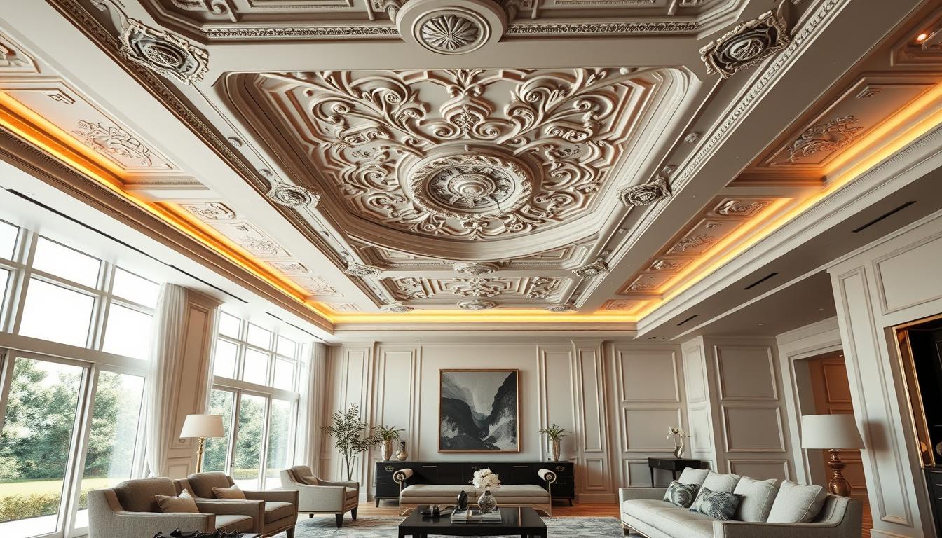
Colors are key in interior design, shaping how we feel in our homes. The right home interior color schemes can turn a house into a cozy home. It becomes a place where we feel at ease.
The colors in our homes affect our mood and feelings. Experts say, “the right paint colour for any room should reflect the mood you want to create in the room as well as complement its architecture and style.” This shows how important it is to think about color’s psychological effects when picking interior color palette ideas.
How Colors Affect Mood and Emotion
Different colors can make us feel different ways. For example, calming colors like blue and green make us feel relaxed. On the other hand, bright colors like red and orange boost energy and activity. Knowing these effects helps us choose the right colors for our homes.
“Colors can dramatically change the ambiance of a room, influencing our mood, energy, and even our appetite.”
Let’s look at how colors affect our feelings:
| Color | Emotional Impact |
|---|---|
| Blue | Calming, Trusting |
| Red | Energizing, Stimulating |
| Green | Balancing, Harmonizing |
The Importance of Color in Design
Color is a key part of interior design, crucial for creating a welcoming space. When picking modern home interior colors, think about how they’ll work together. This will help create the atmosphere you want.
A good color scheme can make your home look great, showing off your style. It can also make a room work better for its purpose.
Understanding color psychology helps us choose colors wisely for our homes. This knowledge lets us create spaces that are not just beautiful but also touch our hearts.
Popular Interior Home Color Trends
Exploring interior home color trends shows that the right hues can make your space better. Keeping up with trends helps you create a stylish, modern home.
According to Benjamin Moore’s Color of the Year, some colors are becoming more popular. They are known for their unique appeal and versatility. Sherwin-Williams also has a variety of popular colors, including timeless neutrals, bold statement colors, and soft pastels.
Neutral Colors: Timeless Choices
Neutral colors are always in style because they’re versatile and timeless. Shades like beige, gray, and taupe make rooms calm and serene. They’re great for living rooms and bedrooms.
Benefits of Neutral Colors:
- Easy to pair with bold accent colors
- Create a sense of spaciousness
- Timeless appeal that doesn’t go out of style
Bold Colors: Making a Statement
Bold colors are perfect for making a statement. Vibrant hues like deep blues, rich reds, and sunny yellows add energy and personality to any room.
Using Bold Colors Effectively:
- Use bold colors on a single accent wall
- Pair bold colors with neutral shades to balance the look
- Consider the room’s purpose and how the color will affect its ambiance
Pastel Colors: Soft and Inviting
Pastel colors are a soft, inviting choice for a more subtle look. Soft pinks, baby blues, and mint greens create a soothing, relaxing environment.
Here’s a comparison of these color trends in a tabular format:
| Color Trend | Description | Ideal Rooms |
|---|---|---|
| Neutral | Timeless, versatile, calm | Living Rooms, Bedrooms |
| Bold | Energetic, statement-making | Accent Walls, Kitchens |
| Pastel | Soft, soothing, relaxing | Bedrooms, Nurseries |
Understanding different color trends helps you make better choices for your home. Whether you choose timeless neutrals, bold statements, or soft pastels, the right color can change your space.
Choosing Colors Based on Room Function
Different rooms have different uses, and the colors you pick should help them work better. Think about how each room fits into your daily life when picking colors.
Living Rooms: Inviting Spaces
The living room is where family and friends come together. Choose colors that make it warm and inviting. Neutral tones like beige or gray are great for this. They let your furniture and decor shine.
If you want to add some excitement, use accent colors in pillows, rugs, or art.
Bedrooms: Relaxing Retreats
Bedrooms should be places of rest and calm. Soft colors like light blue, pale green, or lavender work well. Stay away from bright or bold colors that might keep you awake.
Think about how colors make you feel. Choose colors that help you relax and feel peaceful.
Kitchens: Energizing Environments
Kitchens are for cooking and hanging out. You want colors that make you feel lively and hungry. Warm colors like red, orange, or yellow can be good, but don’t go too far.
Too much color can be too much. Mix bold colors with neutral ones to make your kitchen welcoming.
For more tips on picking the right colors, check out This Old House for expert advice.
| Room | Recommended Colors | Effect |
|---|---|---|
| Living Room | Neutral tones (beige, gray) | Promotes warmth and conversation |
| Bedroom | Soft, soothing colors (light blue, pale green) | Creates a calming atmosphere |
| Kitchen | Warm colors (red, orange, yellow) | Stimulates energy and appetite |
The Role of Natural Light in Color Selection
Natural light changes how colors look in your home. It’s key when picking colors. Think about how light affects your room’s look.

Assessing Light Conditions
To pick the right colors, first check your home’s light. Know your windows’ direction, when you use each room, and your windows’ glass type.
Rooms facing south get lots of direct sunlight, making colors pop. Rooms facing north get softer light, making colors seem calmer. Understanding these light types helps pick colors that look great.
How Light Affects Color Perception
Light changes how we see colors. Natural light makes colors look different at different times. Some colors shine in the morning, others in the afternoon.
It’s important to know how light affects your colors. A color perfect in bright light might not work in dim light. By thinking about light and color, you can pick modern home interior colors that make your home cozy.
When looking at interior color trends and interior color palette ideas, test colors under different lights. Paint swatches on walls and see how they look at different times.
Creating Color Harmony in Your Home
Color harmony is key to a beautiful home. It begins with the color wheel. By picking colors that match well, you can make a stunning color scheme. This will improve your home’s look and feel.
Color Wheel Basics
The color wheel is a basic tool in color theory. It shows how colors relate to each other. It has primary, secondary, and tertiary colors.
Primary colors are red, blue, and yellow. They can’t be made by mixing other colors. Secondary colors, like green and orange, come from mixing two primary colors. Tertiary colors, like blue-green, are made by mixing a primary color with a secondary one.
Knowing the color wheel is vital for home interior color schemes. It helps pick colors that go well together. This makes your home look good and feel right.
Complementary vs. Analogous Colors
There are two main ways to create color harmony: using complementary and analogous colors. Complementary colors, like blue and orange, are opposite each other on the color wheel. They create a strong contrast.
Analogous colors, like blue and green, are next to each other. They make a smooth and calming palette. This is great for bedrooms or living rooms.
Both methods can lead to popular interior paint colors. The trick is to find the right mix that fits your style.
Choosing colors for your home also affects resale value. Neutral colors like beige and gray are good for selling. But, a bold color scheme can make your home stand out and increase its value.
Tips for Combining Multiple Colors
A well-designed color scheme can make your home look amazing. We’ll look at the best ways to mix colors. Mixing colors right can make your rooms more interesting and deep.

Monochromatic Schemes
Using a monochromatic scheme is a smart way to mix colors. It means using different shades of the same color. For example, you can use different blues to make a room feel calm and connected.
To start, pick a main color. Then, find lighter and darker versions of it. For example, if blue is your main color, use lighter blues for walls and darker blues for furniture.
Adding Accent Colors
Monochromatic schemes are elegant, but adding accent colors can make a bold statement. Accent colors are used to highlight certain parts of a room. For example, a bright color on one wall can make a room lively.
Remember the 60-30-10 rule: 60% of the room should be a main color, 30% a secondary color, and 10% an accent color. This keeps the room balanced. Metallic colors like gold or silver can also add class to modern homes.
Combining colors is all about experimenting and having fun. Try different color mixes to find what works for you. With creativity, you can create a color scheme that shows off your style and makes your home beautiful.
The Power of Accent Walls
Accent walls can really make your home stand out. They create a focal point in any room. This draws attention to a special area or feature.
Choosing the Right Wall for Accents
Picking the right wall for an accent is key. Look for a wall that naturally catches your eye, like the one behind a fireplace or a big piece of furniture. Think about the room’s layout and how you move around when choosing.
Popular Accent Wall Colors
Neutral colors like beige, gray, and taupe are classic choices for accent walls. For something bolder, try deep blues, rich greens, or vibrant yellows. Pick a color that fits with the room’s colors but adds a personal touch.
Here’s a look at some popular accent wall colors:
| Color | Effect | Best Used In |
|---|---|---|
| Deep Blue | Creates a cozy, intimate atmosphere | Bedrooms, living rooms |
| Rich Green | Adds a natural, refreshing touch | Living rooms, kitchens |
| Vibrant Yellow | Energizes the space, promotes happiness | Kitchens, dining rooms |
Experts say to see the color in person before making a decision. This ensures it looks good with the room’s lighting and decor.
Choosing the right wall and color for your accent wall can make your home look better. It shows off your personal style and makes the space more appealing.
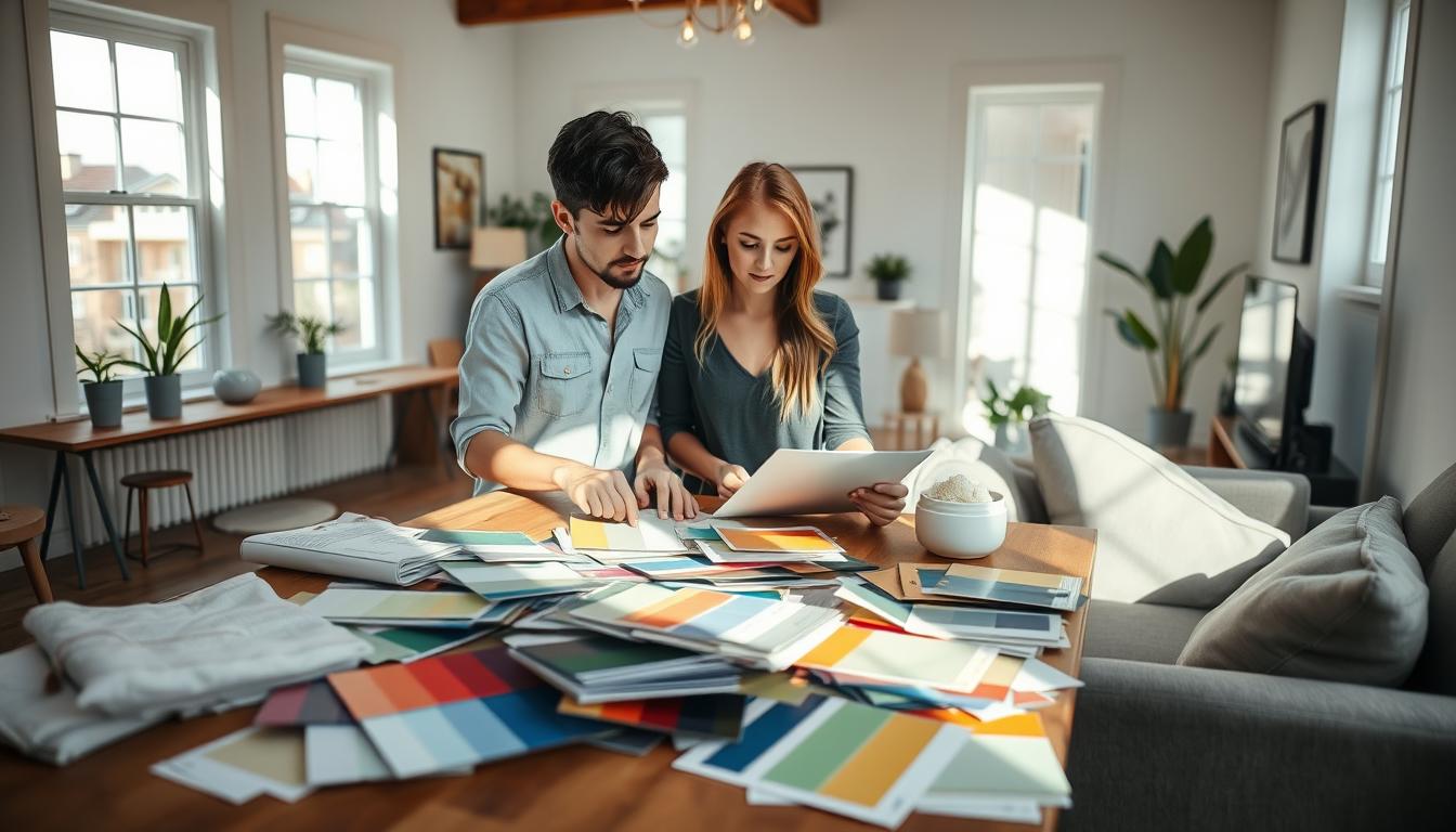
Testing Colors Before Committing
Before you decide on your home’s colors, it’s smart to test them first. This way, you can avoid making expensive mistakes. Testing colors helps ensure they match your home’s decor and lighting.
Sherwin-Williams suggests getting sample paints to try colors at home. This step is key to seeing if your interior home colors will really improve your space.
Sample Paints: Why They Matter
Sample paints do more than just show you the color. They let you see how it looks at different times and under different lights. This is crucial for home interior color schemes, as colors can change from morning to night.
“The right color can transform a room, but it’s essential to test it first.”
By painting samples on your walls, you can see how they work with your furniture and decor. This ensures your colors fit your lifestyle and taste.
Tips for Effective Color Testing
To get the most from color testing, follow these tips:
- Apply samples to different walls to see how the color looks in various lighting conditions.
- Observe the colors at different times of day.
- Consider the color of your furniture and decor to ensure harmony.
Color testing can save you from the trouble and cost of repainting. It’s a simple way to make sure your interior color trends will stay beautiful for years.
| Color Testing Tips | Benefits |
|---|---|
| Apply samples to different walls | See how the color looks in various lighting |
| Observe at different times | Understand color changes throughout the day |
| Consider furniture and decor | Ensure the color complements your home’s style |
By taking the time to test your colors, you can choose a home interior color scheme that makes your home look great. It will also show off your personal style.
Overcoming Common Mistakes in Color Selection
Choosing the right interior colors can be tricky. But with the right advice, homeowners can avoid common pitfalls. It’s not just about what you like; it’s about creating a space that looks and feels good.
Color is key in interior design. It affects mood, energy, and even room size. With so many choices, mistakes are common. We’ll show you how to pick colors wisely, making your home look great.
Avoiding Mismatched Colors
One big mistake is picking colors that clash. Mismatched colors can make a room feel off. Knowing color theory is crucial to avoid this.
The color wheel is a great tool for designers. It shows how colors work together. Complementary colors, opposite each other, create a nice contrast. Analogous colors, next to each other, offer a harmonious look.
- Start with a neutral base color to anchor your palette.
- Add one or two bold colors to create visual interest.
- Use different shades of the same color to create depth.
Understanding Undertones
Understanding a color’s undertones is key. Undertones are the color’s underlying hue, which can be warm or cool. Warm colors make a room cozy, while cool colors are calming.
When picking colors, think about the undertones of paint, furniture, flooring, and decor. Mismatched undertones can look bad. For example, warm wood furniture needs warm paint colors for a cohesive look.
| Color | Warm Undertones | Cool Undertones |
|---|---|---|
| Red | Orange-red | Pink-red |
| Blue | Green-blue | Purple-blue |
Knowing undertones and avoiding color clashes helps create a beautiful color scheme. Whether you want best interior colors for resale or interior color palette ideas for a modern home, balance your style with timeless design.
Final Thoughts on Choosing Interior Home Colors
Choosing the right interior home colors is a personal choice. It involves thinking about color psychology, current trends, and natural light. Different colors can greatly affect our mood and the feel of our homes.
Personalizing Your Space
It’s important to make your home reflect your style. Your home should be a place where you feel comfortable and welcome. Think about the colors that you like and how they can fit into your home’s color scheme.
Expert Guidance
If picking the right colors is hard, get help from experts. Companies like Sherwin-Williams offer virtual consultations. They can give you advice to help you choose colors that fit your style.