Did you know that the colors used in your living space can affect your mood and well-being? A well-chosen interior color scheme can turn your home into a cozy and stylish retreat. The key to a stylish space is a thoughtful color palette that shows off your personality and taste.
We’ll show you how to pick the right colors for your space. This way, your home will be both stunning and practical. Our expert advice will help you create a welcoming and balanced atmosphere.
Key Takeaways
- Understand the impact of color on your mood and well-being
- Learn how to choose a color palette that suits your style
- Discover expert tips for a harmonious interior design
- Create a stylish and inviting living space
- Explore the role of interior color schemes in transforming your home
Understanding the Importance of Color in Interior Design
In interior design, color is more than just a visual element. It’s a powerful tool that affects our mood and how we see space. The colors we pick for our homes can greatly impact our emotional well-being and how we feel about the space.
Colors can make us feel strong emotions and change the mood of our living areas. For example, warm colors like red, orange, and yellow make us feel warm and energetic. On the other hand, cool colors like blue, green, and purple calm us down.
Emotional Impact of Colors
The emotional impact of colors is key in interior design. Different colors can make us feel different ways. For instance:
- Red is often linked with passion and energy.
- Blue is known for its calming and soothing effects.
- Green represents nature and can make us feel balanced and harmonious.
Knowing these emotional triggers helps us choose colors wisely for our homes. This ensures our living spaces support our emotional health.
How Colors Influence Space Perception
Colors not only affect our emotions but also how we see the size and layout of our rooms. Lighter colors can make a room seem bigger and more open. Darker colors can make a space feel cozy and intimate. This is important when we think about home decor trends that want our spaces to feel open and flowing.
Some key things to consider are:
- Using lighter shades on walls to make a room feel open.
- Using darker tones in big spaces to define areas.
- Picking colors that match the natural light in a room.
By carefully applying these principles, we can make our homes more functional and beautiful. We create spaces that are not just visually appealing but also emotionally meaningful.
Current Color Trends for Homes
In 2023, interior design is buzzing with new color trends. These trends promise to change how we see our homes. This year, we see a mix of old and new colors that appeal to many.
Popular Color Palettes in 2023
This year’s colors include soothing neutrals and bold statements. Earth tones like terracotta, sienna, and moss green are popular. They add warmth and make homes feel cozy.
For those who want to be trendy, check out our top trendy interior design homes. They offer great ideas.
“The resurgence of earthy tones is not just a trend; it’s a reflection of our desire to reconnect with nature.”
Incorporating Pantone’s Color of the Year
Pantone’s Color of the Year is a big deal in design. For 2023, it’s a bright color that will make your home pop. You can add it with simple pieces or a bold wall.
To use Pantone’s Color of the Year, try it on accent walls, furniture, or decorative accessories. It brings sophistication and modernity to your space.
Choosing the Right Color for Each Room
Choosing the perfect color for each room can feel overwhelming. But, the color wheel can help. It’s a key tool in interior design, guiding us in picking the right paint colors for our homes.
Living Room Color Schemes
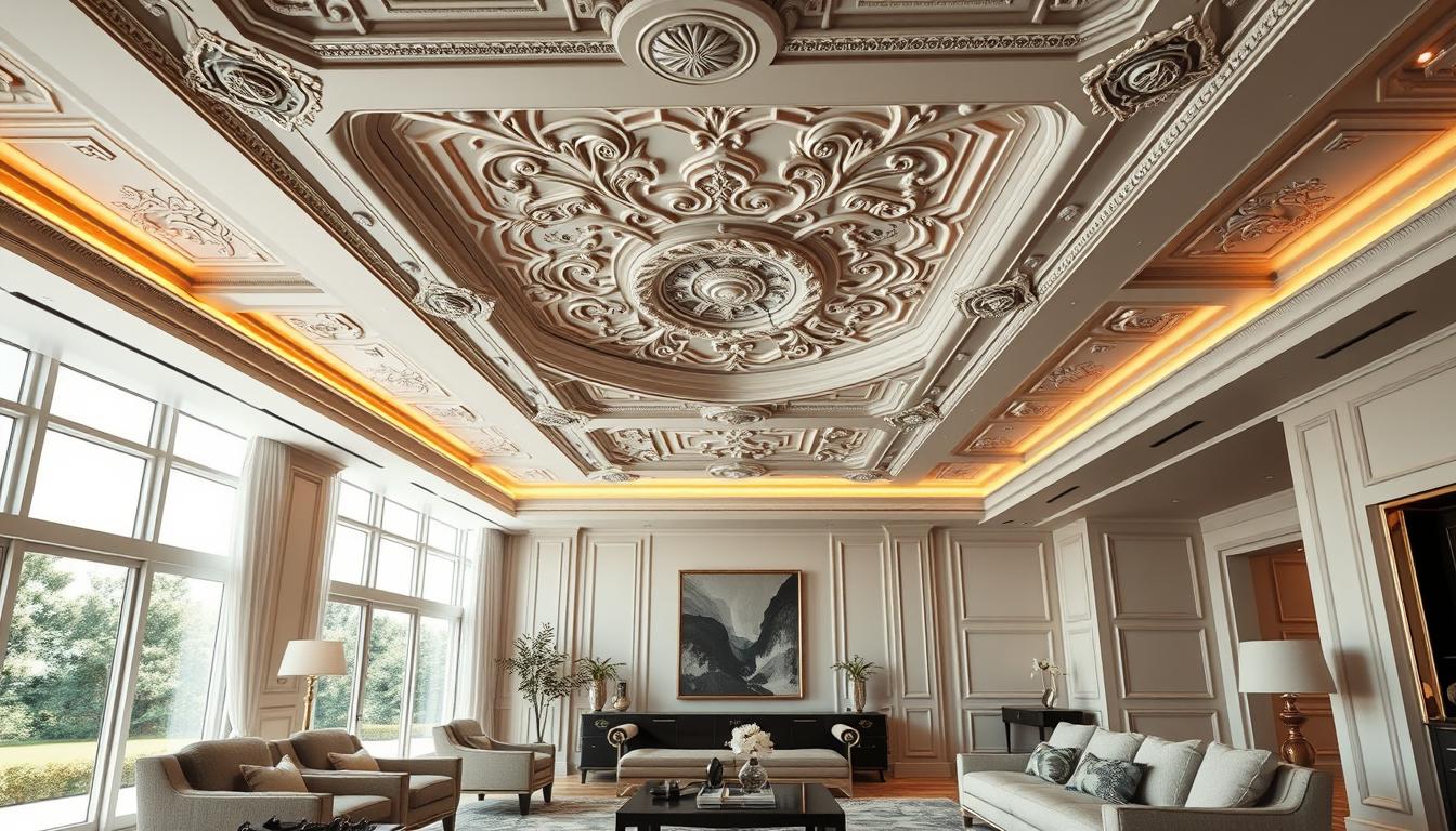
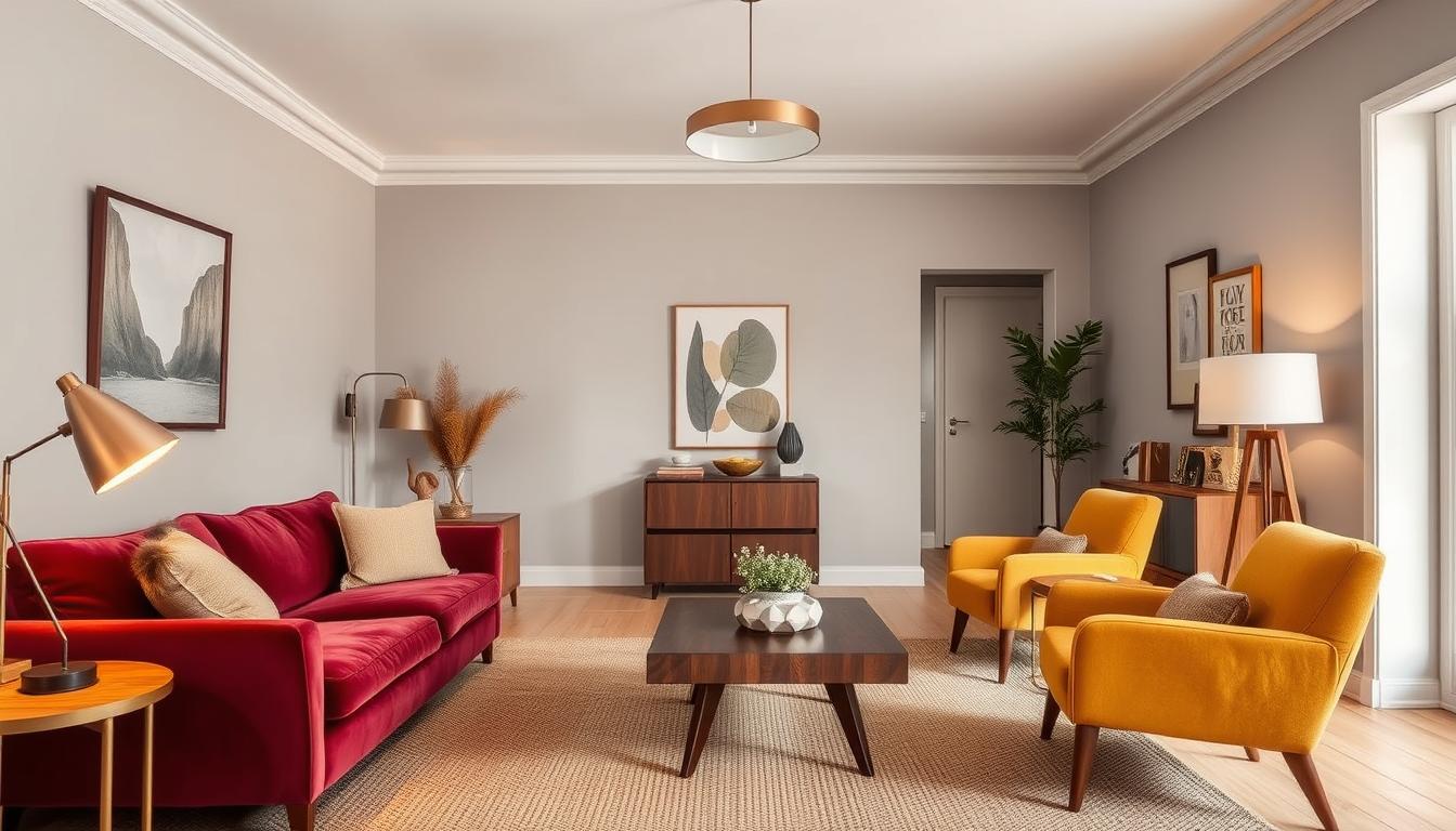
The living room is the heart of the home, where everyone gathers. So, the color scheme should be welcoming and cozy. Neutral tones like beige, gray, or taupe are great. They offer a calm base for adding furniture and decor.
For a lively feel, try warm colors like terracotta or golden brown. They add coziness and energy. Or, cool colors like blues and greens can make the room feel soothing, perfect for unwinding.
Best Colors for a Relaxing Bedroom
The bedroom is your sanctuary, where you rest and recharge. Soft, calming colors are best for a peaceful vibe. Soft blues, muted greens, and gentle lavenders are great. They encourage serenity and calm.
- Soft blues can help reduce stress and promote sleep.
- Muted greens bring balance and harmony to the bedroom.
- Gentle lavenders are calming, making them ideal for a bedroom.
Energizing Colors for Home Offices
A home office needs colors that boost creativity and productivity. Bright yellows and vibrant oranges are perfect. They increase energy and focus.
- Bright yellows improve concentration and memory.
- Vibrant oranges spark creativity and enthusiasm.
Knowing how colors affect each room’s ambiance and function helps in choosing paint colors. The color wheel is a valuable tool. It helps pick colors that look good together and serve each room’s purpose.
The Psychology of Color in Home Spaces
Colors are key in interior design, shaping both looks and feelings. The colors we pick can change our mood, energy, and happiness at home.
Warm vs. Cool Colors
The fight between warm and cool colors is key in color psychology. Warm colors like reds, oranges, and yellows make us feel cozy and awake. They boost our senses and energy.
Cool colors such as blues, greens, and purples calm us down. They help lower stress and make us relax.

Color Associations and Their Effects
Colors have different meanings that shape how we see and use our homes. Blue, for example, brings peace and trust. It’s great for bedrooms and bathrooms.
Green, linked to nature and growth, is perfect for living rooms and kitchens. It brings balance and harmony.
Knowing these color meanings is vital for home renovation color ideas. It changes how a room feels and works. By picking colors wisely, we can make spaces that are not just pretty but also good for our health.
Creating Cohesion with a Color Palette
Creating a cohesive color palette is key for a stylish home. A well-chosen color scheme can make your home look more put together. It makes your home visually appealing.
Selecting a Base Color
Start by picking a base color. This color will be the core of your design. All other colors will complement it. Think about the mood you want in your home.
For example, calming blues and greens are great for bedrooms. Vibrant colors like red and orange can energize living areas.
Tips for Choosing a Base Color:
- Consider the natural lighting in your home.
- Think about the color of your furniture and decor.
- Reflect on your personal preferences and style.
Accent Colors: What to Choose
After picking your base color, choose accent colors. These colors should enhance your base color and add depth. The goal is to create a balanced look.
Use the 60-30-10 rule as a guide: 60% of your room should be the base color, 30% a secondary color, and 10% an accent color.
Popular accent color options include:
- Neutrals like beige, gray, or taupe.
- Bold colors that contrast with your base color.
- Metallic tones like gold, silver, or copper.
By choosing a base color and accent colors wisely, you can create a color palette that follows home decor trends. This thoughtful approach will result in a beautiful, harmonious living space. You’ll love spending time in it.
Tips for Painting Techniques and Finishes
Choosing the right painting techniques and finishes is key to a stylish home. The finish you pick affects how your walls look, last, and how easy they are to keep up.
The Benefits of Matte vs. Glossy Finishes
Matte and glossy finishes have their own perks. Matte finishes hide wall flaws and offer a calm, simple look. They’re great for bedrooms and living rooms.
Glossy finishes are tough and easy to clean, perfect for busy spots like kitchens and bathrooms. But, they show wall blemishes and smudges more.
- Matte finishes:
- Hide wall imperfections
- Create a subtle look
- Ideal for low-traffic areas
- Glossy finishes:
- More durable
- Easy to clean
- Suitable for high-traffic areas

Utilizing Color Wash Techniques
Color wash techniques bring depth and interest to your walls. They involve a translucent paint layer over a base coat, giving a soft, blended look.
To get a stunning color wash, follow these steps:
- Start with a base coat on the wall.
- Make a glaze by mixing paint with a thinner.
- Use a soft cloth or sponge to apply the glaze over the base coat.
- Blend the colors for the look you want.
Using color wash techniques can elevate your home’s interior design, adding elegance and sophistication.
Utilizing Natural Light and Colors
Knowing how natural light affects color is crucial for good interior design. Natural light can change how colors look in our homes. So, it’s important to think about this when picking colors.
How Light Affects Interior Color Perception
Natural light changes during the day, altering color appearances in rooms. A color might look bright in the morning but less so in the afternoon. This means colors can look different at different times of the day.
To make the most of natural light on your colors, think about your room’s orientation. North-facing rooms get softer, indirect light. South-facing rooms get direct sunlight most of the day. East- and west-facing rooms have a mix, with light changing throughout the day.
Best Color Combinations with Natural Lighting
Choosing the right colors for natural light can make your spaces more beautiful. For rooms with lots of natural light, use lighter shades to keep things bright and airy.
For more tips on picking the best colors for your home, check out our guide on selecting interior home colors.
| Room Orientation | Recommended Colors | Effect of Natural Light |
|---|---|---|
| North-facing | Cool, calming shades like blues and greens | Soft, indirect light enhances these colors |
| South-facing | Warm, vibrant colors like oranges and yellows | Direct sunlight intensifies these hues |
| East/West-facing | Neutral tones like beiges and grays | Changing light conditions are balanced by these versatile colors |
By understanding how natural light affects your colors and picking the right ones, you can make a welcoming home. It will show off your style and match the natural light in your space.
Accentuating Architectural Features with Color
Color can make your home’s unique details stand out. It not only makes your home look better but also adds character to your spaces.
Highlighting Moldings and Trim
Moldings and trim can really benefit from the right color. Painting them a contrasting color makes them pop. For example, white moldings look great against soft walls, adding elegance.
When picking a color for moldings and trim, think about your home’s color scheme. You can match them to the room’s color or introduce a new color for depth and interest.
Bold Colors for Accent Walls
Accent walls are a great way to add bold colors without overwhelming the room. A bold, contrasting color on one wall creates a focal point, adding energy.
Choose a bold color for an accent wall based on the room’s purpose and mood. For instance, a deep blue can make a bedroom cozy, while a vibrant red can energize a living room.
| Room Type | Recommended Bold Colors | Effect |
|---|---|---|
| Living Room | Vibrant Red, Deep Orange | Energizing, Social |
| Bedroom | Deep Blue, Soft Purple | Calming, Intimate |
| Home Office | Bright Green, Electric Blue | Stimulating, Focused |
In conclusion, using color on moldings, trim, and accent walls can greatly improve your home’s design. By choosing colors that complement or contrast these features, you create a unique space that shows off your style.
Color in Textiles and Décor
Color in textiles and décor is key to a cozy home. Fabrics for furniture, rugs, and curtains add color, texture, and warmth. They are essential in interior design.
When picking textiles and décor, think about the color scheme. Choosing complementary fabrics is crucial. For example, a bold color palette might need neutral fabrics to balance it.
Choosing Complementary Fabrics
To pick complementary fabrics, identify your room’s dominant colors. Then, choose fabrics that match or complement these colors. For instance, blue walls might go with curtains in a lighter blue or cream.
| Color Scheme | Complementary Fabric Choices |
|---|---|
| Monochromatic | Various shades of the same color |
| Complementary | Colors opposite each other on the color wheel |
| Analogous | Colors next to each other on the color wheel |
Experts say balance is key for a good color scheme. Mixing bold colors with neutrals makes a space look great.
Using Rugs and Curtains to Enhance Color
Rugs and curtains do more than just serve a purpose. They can also boost a room’s color. A bright rug can add color, while curtains can frame windows and add depth.
Starting with a rug or curtains is a good way to introduce a new color. These items are easy to change if you want to update your color scheme. As
“The right rug can tie a room together, adding warmth and texture underfoot.”
When picking rugs and curtains, think about your walls, furniture, and other decor. Choosing items that complement these elements creates a cohesive space.
By carefully choosing color in textiles and décor, you can improve your home’s color schemes. This makes your home welcoming and reflects your style.
Common Color Mistakes to Avoid
Choosing the right colors for your home is crucial. It sets the mood and look of your space. When picking paint colors for your home, it’s easy to make mistakes. These mistakes can change how your space feels and looks.
Overwhelming Spaces with Dark Colors
Dark colors can make a room cozy and dramatic. But, using too much can make it feel small and crowded. To fix this, balance dark walls with lighter colors for furniture and trim.
For example, dark blue walls paired with white trim and light floors can look great. This mix creates a nice contrast.
Ignoring the Flow from Room to Room
Not thinking about color flow between rooms is another mistake. When colors clash, it breaks the harmony in your home. To keep things cohesive, pick a core color palette for all rooms.
Using different shades or combinations of core colors in each room helps. This way, you can be creative while keeping your home’s look consistent.
Final Thoughts on Home Color Interior Design
Choosing the right colors can turn a house into a home. Understanding color’s role in design is key. Keeping up with trends helps you create a space that shows your personality.
Seasonal Color Updates
Seasonal colors can make your home look new and lively. Using colors that match the season keeps your space modern and welcoming. For example, warm colors in fall add coziness, while spring’s bright colors energize your home.
Personalizing Your Space
Choosing colors that reflect your style is essential. It makes your house feel like home. Whether you like bold colors or soft ones, pick what makes you happy and comfortable.