Did you know that the colors we choose can really affect our mood and how productive we are? Trendy color schemes are more than just pretty; they can turn our homes into havens that show off our unique style.
When we dive into design, it’s key to keep up with the newest popular home interior colors. These colors can make our homes feel more welcoming. In this article, we’ll look at the hottest color trends. We’ll share tips on how to bring these styles into your home.
Key Takeaways
- Understanding the impact of color on mood and productivity.
- Exploring the latest top trending color schemes.
- Practical tips on incorporating trendy colors into your home.
- The importance of color in creating a beautiful and inviting atmosphere.
- Guidance on making informed decisions for your home’s aesthetic.
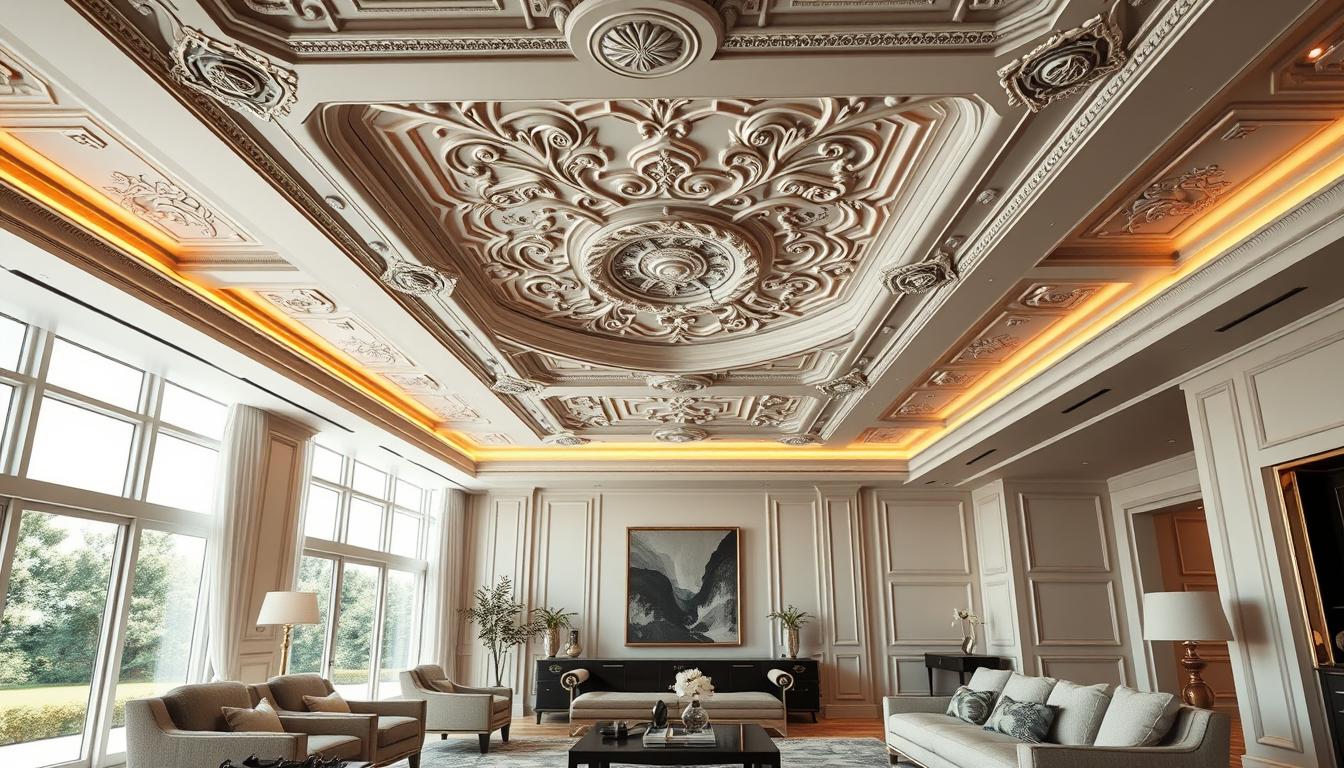
Understanding the Importance of Color in Home Interiors
Color plays a huge role in interior design. It affects our mood, energy, and well-being. The colors we pick can change how our homes look and feel.
The Psychology of Color
Color psychology is all about how colors make us feel. Different colors can make us feel calm or excited. For example, blue tones are calming, great for bedrooms. Warm colors like orange and red boost energy, perfect for living rooms.
How Color Affects Mood and Atmosphere
The colors we choose shape the mood and feel of each room. Soft pastels are calming, while bold and bright colors add energy. Think about the room’s purpose and the mood you want to create. For more tips on picking the right colors, check out our guide on selecting interior paint colors for homes.
| Color | Emotional Impact | Suitable Room |
|---|---|---|
| Blue | Calmness, Serenity | Bedroom, Bathroom |
| Red/Orange | Energy, Stimulation | Living Room, Kitchen |
| Green | Balance, Harmony | Living Room, Bedroom |
Knowing how color psychology works is key to picking the right colors for your home. By choosing colors that match each room’s purpose, you can make your home welcoming and harmonious.
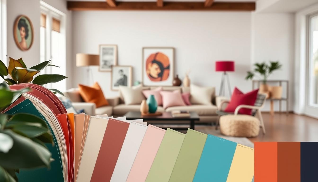
Trending Color Palettes for 2023
2023 is bringing fresh color palettes to home interior design. We see a blend of old and new hues for all tastes. Whether updating your whole home or just one room, knowing the trends helps you choose wisely.
Neutrals with a Twist
Neutral colors are still key in 2023, but with a twist. Warm undertones are added to cool neutrals, or a pop of color is introduced. For example, mixing soft gray with warm beige creates a unique look.
Some trending neutral colors include:
- Soft grays with warm undertones
- Creamy whites with a hint of yellow
- Taupe tones that lean towards brown
Subtle Pastels and Soft Hues
Pastel colors are back in 2023, but softer. These hues bring elegance and sophistication. For a vibrant and colorful home interior, pair soft pastels with neutrals.
| Color | Room | Effect |
|---|---|---|
| Soft Peach | Living Room | Warm and Inviting |
| Pale Lavender | Bedroom | Calming and Serene |
| Mint Green | Kitchen | Fresh and Cool |
Bold and Bright Colors
2023 is the year for bold and bright colors in your home. Use them for walls or furniture to add color. Experts say to balance bold colors with neutrals to avoid too much.
“Color is a power which directly influences the soul. Color is the keyboard, the eyes are the hammers, the soul is the piano with many strings. The artist is the hand that plays, touching one key or another, to cause vibrations in the soul.” – Wassily Kandinsky
Some trending bold colors include:
- Deep blues and navies
- Vibrant corals and oranges
- Rich emeralds and greens
Popular Accent Colors to Consider
To make your home look stylish and modern, think about using popular home decor hues. Accent colors add depth and personality to your home. They are key in interior design.
Choosing the right accent colors is important. They can make your home pop or tie everything together. The right colors can really enhance your home’s look.
Deep Blue and Navy Shades
Deep blue and navy shades are trendy stylish wall colors. They bring sophistication and elegance to any room. Use them as accent walls or in furniture and accessories for a unified look.
Earthy Greens and Natural Tones
Earthy greens and natural tones are also popular. They bring calm and serenity to your home. They’re great for a natural, organic look.
Think about your home’s natural light when using these colors. It can change how they look. Try different shades and combinations to find the perfect match for your space.
Choosing the Right Color for Each Room
Different rooms have different uses, and the right color can make each space better. When picking interior paint colors for homes, think about what you want each room to feel like.
Let’s look at some best color choices for interiors for different rooms in your home.
Living Room Color Suggestions
The living room is where family and friends hang out. Choose warm, inviting colors to make it feel cozy and lively.
- Soft neutrals like beige or light gray can create a calm atmosphere.
- Warm tones such as terracotta or golden brown can add coziness.
- For a bolder statement, consider deep blues or rich greens that can add depth and sophistication.
Bedrooms: Soft and Cozy Color Choices
Bedrooms are places for rest and relaxation. Choose colors that help you relax and feel calm.
- Soft pastels like pale pink or baby blue can create a soothing ambiance.
- Muted greens or blues can bring a sense of tranquility.
- For a more dramatic effect, consider rich charcoal or plum, but balance these with lighter accents.
Kitchen Colors for a Welcoming Feel
Kitchens are where memories are made. The color can really set the mood.
- Bright and cheerful colors like sunny yellow or vibrant orange can energize the space.
- Soft whites or creams can make the kitchen feel clean and inviting.
- For a more modern look, consider bold colors like navy blue or emerald green for accent walls or cabinets.
Choosing the right colors for each room can make your home look and feel better. The best color choices for interiors are those that show your style and meet each room’s needs.
The Influence of Nature on Color Choices
Adding nature to our homes makes us feel better and helps us pick the right colors. Nature’s beauty inspires us to create spaces that are both lovely and good for the planet.
Nature-Inspired Palettes
Nature has many colors for our homes. From sunrise hues to forest tones, these colors can make our designs stand out.
Some favorite nature colors include:
- Earth tones: shades of brown, beige, and taupe that remind us of the outdoors.
- Ocean blues: from sky blue to navy, these colors bring the sea inside.
- Botanical greens: from mint to forest, these greens add freshness to our spaces.
Terrapin Bright Green, a leader in biophilic design, says, “Biophilia is more than plants. It’s about making spaces that are good for us.”
Biophilic Design Elements
Biophilic design is about more than colors. It’s about using natural materials, textures, and patterns in our homes. This makes our spaces look better and connects us to nature.
| Biophilic Element | Description | Example |
|---|---|---|
| Natural Materials | Using materials found in nature | Wooden furniture, stone countertops |
| Organic Textures | Incorporating textures that mimic nature | Jute rugs, woven baskets |
| Botanical Patterns | Using patterns inspired by plants and flowers | Floral wallpaper, leaf-patterned fabrics |
By using nature’s colors and biophilic design, we make homes that are stylish and caring. As we look for the latest colors, let’s remember nature’s timeless beauty and inspiration.
Timeless Colors That Never Go Out of Style
In the world of home decor, some colors stay popular forever. These classic hues are stylish and elegant for years. We’ll look at whites and grays, two timeless colors.
Classic White and Off-White Variations
White is a timeless choice for homes. It makes rooms look bigger, brighter, and welcoming. Classic white includes many shades, from pure white to creamy off-white.
Off-white shades like ivory, cream, and beige warm up a room. They keep the brightness and airiness of white. These colors work well with other timeless colors.

Grays That Stand the Test of Time
Grays are popular in modern homes. They provide a neutral background for many decorating styles. Grays range from soft, light shades to deep, charcoal tones.
| Gray Shade | Effect | Best Used In |
|---|---|---|
| Light Gray | Creates a sense of openness and serenity | Bedrooms, Living Rooms |
| Medium Gray | Provides balance and neutrality | Kitchens, Bathrooms |
| Charcoal Gray | Adds depth and sophistication | Accent Walls, Furniture |
Using these timeless colors in your decor creates a lasting look. Whether you like white’s crispness or gray’s versatility, these colors will stay popular home interior colors for years.
How to Create a Cohesive Color Scheme
A well-designed color scheme is key to a stylish home. It brings a sense of continuity and visual appeal. When picking colors, think about the look you want and how colors work together.
Let’s explore color theory basics. It helps us mix colors harmoniously. Color theory looks at colors’ hue, saturation, and value. Knowing these is vital for choosing colors.
Understanding Color Theory Basics
Color theory uses the color wheel, a circular chart of colors. It shows primary, secondary, and tertiary colors, and warm and cool colors. Warm colors like reds and oranges feel energetic. Cool colors, such as blues, are calming.
For a cohesive color scheme, pick colors next to each other on the color wheel. These are called analogous colors. This method ensures colors blend smoothly, creating a harmonious look.
| Color Type | Description | Example Colors |
|---|---|---|
| Warm Colors | Evokes warmth and energy | Red, Orange, Yellow |
| Cool Colors | Creates a calming atmosphere | Blue, Green, Purple |
| Analogous Colors | Colors next to each other on the color wheel | Blue, Green, Yellow-Green |
Tips for Mixing and Matching Colors
Mixing colors can be tricky, but there are ways to get it right. Use a main color and add one or two secondary colors. The 60-30-10 rule is also helpful, where 60% is the main color, 30% a secondary, and 10% an accent.
Also, think about the natural light in your space. It changes how colors look. Test your colors at different times to see how they appear.
By learning color theory and using these tips, you can create a cohesive color scheme. This will make your home interior more beautiful. Remember, a thoughtful color selection is key to a stylish and welcoming space.
The Role of Lighting in Color Perception
Lighting greatly affects how we see colors in our homes. It changes the mood and look of our spaces.
There are two main types of lighting: natural and artificial. Natural light shows colors most accurately. But, it changes with the day and weather.
Natural vs. Artificial Light
Artificial light is consistent and can be adjusted. It includes incandescent, fluorescent, and LED lights. Each affects color differently.
- Incandescent lights make colors seem warmer, like yellow or red.
- Fluorescent lights can make colors appear cool, with a blue tint.
- LED lights offer a wide range, from warm to cool tones.
How to Select Lighting that Enhances Colors
To make colors pop, follow these tips:
- Use different light sources together for a balanced look.
- Choose light temperatures: warm for cozy, cool for task areas.
- Make sure lights can be dimmed to match the time and activity.
By picking and mixing your lighting, you can make sure your colors shine. This creates a welcoming and beautiful home.

Incorporating Textures and Materials with Colors
To make a space truly unique, we need to think about colors, textures, and materials together. Colors set the mood, while textures and materials add depth and interest.
Choosing the right textures and materials is key. If you pick bold colors, smooth textures can balance them. For softer colors, rougher textures can add character.
Choosing Complementary Textures
Textures greatly impact a room’s look. Mixing different textures makes the space more interesting. Try pairing smooth surfaces like glass or metal with rough ones like wood or woven fibers.
- Soft fabrics like velvet or linen make a room cozy.
- Rough wood or stone brings a natural feel.
- Metallic accents add glamour.
It’s important to find the right balance when mixing textures. Too many can make a room feel busy. Start with a main texture and add one or two others to enhance it.
Mixing Materials for Depth and Interest
Using different materials also adds depth and interest. Combining materials like wood, metal, and glass makes a room lively.
- Wood brings warmth and can be used for furniture, floors, or walls.
- Metal adds a modern touch.
- Glass adds elegance, whether in tables, shelves, or decor.
By carefully choosing textures and materials, you can make a space that looks great and feels welcoming. The goal is to find a balance where everything works well together.
Tips for DIY Painting and Color Application
Painting your home’s interior can be a fun DIY project. Think about the look you want and the color palettes that excite you.
Start by getting your space ready. Clear the room, cover floors and furniture, and fix any wall holes or cracks.
Preparation is Key
Choosing the right materials is important. Pick high-quality paint that matches your colors and the wall type. Think about durability and finish.
Achieving a Flawless Finish
For a professional look, use the right techniques. Apply primer if needed, use the correct brush or roller, and paint in sections for even coverage.