Did you know the right interior design color schemes can boost your home’s value by up to 5%? The colors you pick for your home’s interior are key to making it welcoming. They greatly affect its look and feel.
Choosing the perfect color palette for home interior is more than taste. It’s about making a space that feels like home. We’ll show you how to pick colors that match your style and make your home better.
Key Takeaways
- Understand the basics of interior design color schemes
- Learn how to choose a color palette that suits your home’s style
- Discover the impact of color on the ambiance and value of your home
- Explore tips for selecting the perfect colors for different rooms
- Get insights into the latest trends in home interior color palettes
Understanding the Importance of Color in Home Design
Color plays a huge role in home design, affecting our mood and well-being. The colors we pick for walls, furniture, and decor change a room’s feel. This makes choosing colors very important.
Emotional Impact of Color
Colors deeply affect our emotions, with each hue triggering different feelings. Warm colors like red, orange, and yellow boost energy and warmth. On the other hand, cool colors like blue, green, and purple calm us down.
Here are some examples of how colors can change our mood:
- Red: It’s linked to passion and energy, making our heart rate go up and encouraging talk.
- Blue: It’s calming, reducing stress and bringing peace.
- Green: It balances us, easing eye strain and bringing harmony.
Color Psychology Basics
Color psychology studies how colors affect us. Knowing this can help us pick the right colors for our homes. Colors can change our mood, energy, and even what we eat.
“Colors are forces, radiant energies that affect us positively or negatively, whether we are aware of it or not.” – Faber Birren, Color Psychologist
Choosing the right colors can make our homes look better and feel welcoming. Here’s a simple table showing how different colors affect us:
| Color | Emotional Impact |
|---|---|
| Red | Energy, Passion |
| Blue | Calmness, Serenity |
| Green | Balance, Harmony |
Exploring color psychology shows us how the right colors can make our homes more comfortable and inviting.
Popular Color Trends for Home Interiors
Color trends are key in home interiors. The right colors can make a house feel like a home. They show our style and personality.
Today, we see a focus on colors that make spaces look good and feel good. We’ll look at two big trends: earthy tones for comfort and bold colors for drama.
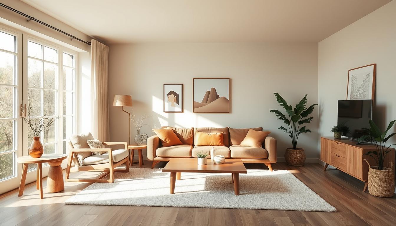
Earthy Tones for Comfort
Earthy tones are popular for their warmth and coziness. They include greens, terracotta, and sandy neutrals, inspired by nature.
- Soothing Greens: Shades like sage, moss, and olive green create calm spaces.
- Terracotta Hues: Warm reds add coziness, like natural clay.
- Neutral Beiges: Soft, sandy tones are great for furniture and decor.
Experts say earthy tones bring peace and connect us to nature. Elle Decor notes, “Earth tones bring the outdoors inside.”
Bold Colors for Statement Spaces
Bold colors are making a big impact in homes. Vibrant blues and deep reds add personality and drama.
| Color | Effect | Best Used In |
|---|---|---|
| Vibrant Blue | Energizing and uplifting | Workspaces, kitchens |
| Deep Red | Cozy and dramatic | Living rooms, dining areas |
| Bright Yellow | Happy and inviting | Kitchens, entryways |
Choosing bold colors depends on the room’s purpose and mood. A leading designer says, “The right bold color can make a room stand out, showing the homeowner’s personality.”
By using these color trends, homeowners can make spaces that are both beautiful and meaningful.
Choosing the Right Color Palette for Each Room
Choosing colors for your home is like painting a masterpiece. Each room has its own purpose, and the colors should match. For example, a living room needs bright colors to feel welcoming. A bedroom should have soft colors for peace.
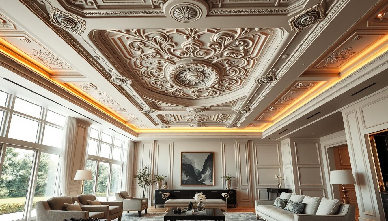
Living Room Color Ideas
The living room is where we spend time with loved ones. Warm colors make it feel cozy and inviting. Think about:
- Earth tones like beige and taupe
- Rich jewel tones like emerald green and navy blue
- Soft pastels for a subtle vibe
Playing with these colors can make your living room unique. Mixing earthy tones with bold colors adds depth and interest.
Bedroom Serenity with Soft Colors
Bedrooms are our retreats for rest and relaxation. Soft colors help us sleep better. Try:
- Soft blues and pale lavenders
- Mint green and creamy whites
- Gentle grays and taupes
These colors create a calm space. They help us relax after a busy day.
Kitchen Color Combinations
Kitchens are where we make memories and share meals. The right colors can make it lively and welcoming. Think about:
- Bright colors like yellow and orange
- Cool tones like blue and green
- Neutral tones like white and gray
Using these colors creatively makes your kitchen both beautiful and functional.
Tools and Resources for Creating Color Palettes
Finding the perfect colors for your home is now easier. Many tools and resources help you create beautiful color palettes. These tools are great for both experienced designers and DIY fans. They make picking the right colors for your home easy.
Online Color Palette Generators
Online color palette generators have changed how we choose colors. These tools let you make custom palettes. You can choose the colors you like, like monochromatic or complementary.
- Adobe Color: A powerful tool for creating color palettes and exploring color theory. It works well with Adobe Creative Cloud apps.
- Coolors: Easy to use, it lets you make palettes fast and pick colors from a big library.
- Color Hunt: A place with lots of pre-made palettes for inspiration or use in your projects.
Paint Samples and Swatches
While digital tools are great, nothing beats real paint samples and swatches. Testing paint on your walls shows how it looks in different lights and times. It’s very helpful.
“The color of a room is not just about the paint; it’s about how that color interacts with the light, the furniture, and the overall ambiance you wish to create.” –
| Brand | Type | Notable Feature |
|---|---|---|
| Benjamin Moore | Paint Samples | Accurate color representation |
| Behr | Paint Swatches | Durable and water-resistant |
| Sherwin-Williams | Color Cards | Extensive color library |
Using online tools and paint samples together helps you create perfect color schemes. This way, you can make your home look exactly how you want it to.
Combining Colors: Understanding Color Theory
Color theory is key in home interior design. It helps create color combinations that look great together. It’s not just about choosing colors you like. It’s about how they work together.
To make your home look stunning, you need to learn color theory basics. It’s about how colors interact and how to mix them for the best look.
Complementary Colors Explained
Complementary colors are pairs that are opposite each other on the color wheel. They make each color pop and look more intense. For example, blue and orange together create a lively atmosphere.
But, using complementary colors needs balance to avoid too much. A main color with a touch of its opposite can look great and feel right.
Monochromatic vs. Analogous Schemes
A monochromatic color scheme uses different shades of one color. It makes a room feel calm and connected. Using different blues, from light to navy, can make a room peaceful.
An analogous color scheme uses colors next to each other on the wheel. It makes colors flow smoothly. Using green, blue-green, and blue creates a natural feel.
Both monochromatic and analogous schemes are great for a home decor color ideas that make your home beautiful.
How Lighting Affects Your Color Choices
The way lighting and color work together can change a room’s feel. It’s key to think about lighting when picking paint colors for your home.
Lighting comes in two types: natural and artificial. Each type changes how colors look in different ways.
Natural vs. Artificial Light
Natural light changes with the day, altering color looks. Artificial light stays the same but can change color effects based on its temperature.
Warm white lighting brings out warm colors, while cool white lighting highlights cool tones. Designer Kelly Wearstler says, “Lighting is vital in design, as it can change a space’s look and feel.”
“The right lighting can make a room feel cozy and inviting or bright and energizing, depending on the effect you’re after.”
Color Temperature and Mood
The color temperature of lighting, measured in Kelvin (K), greatly affects a room’s mood. Warm lighting (lower Kelvin) makes a space cozy and relaxing. Cool lighting (higher Kelvin) makes it feel more energized and lively.

When picking paint colors, think about the room’s lighting. Test paint samples under different lights to make sure the color looks good all day.
Knowing how lighting impacts color helps us choose better paint colors for our homes. This enhances our living spaces’ look and feel.
Testing Your Color Palette
Creating a great interior design starts with testing your color palette. It’s important to see how your colors look in different lights and on various surfaces before deciding.
How to Use Paint Samples
Paint samples are a smart way to test your colors. Instead of painting a whole wall, start with small areas. This lets you see how colors work together and with your room’s lighting.
Tip: Paint samples in different parts of the room. This shows how the color looks at different times and under different lights.
Viewing Colors in Different Lighting
Lighting changes how a color looks. Natural light can reveal undertones, while artificial lighting can change its look. It’s key to see your samples under both types of light.
“The right color can transform a room, but it’s the lighting that brings the true magic.”
View your samples at various times and under different lights. This gives you a clear idea of how the color will look in your space.
Testing your color palette with paint samples and observing under different lights ensures your interior color trends will fit your home perfectly.
DIY Tips for Painting and Decorating
With the right techniques and preparation, you can achieve professional-looking results when painting and decorating your home. Coordinating colors for interior design is a crucial aspect of this process, as it sets the tone for the entire space.
As we explore the world of DIY painting, it’s essential to remember that preparation is key. A well-prepared surface ensures a smooth and even finish, making the task less daunting.
Preparing Your Space for Painting
Before you begin painting, it’s crucial to prepare your space. This involves clearing the room of furniture and covering the floor with drop cloths or plastic sheets to prevent damage from paint spills.
Next, remove outlet covers and switch plates, and wash the walls to remove dirt, grime, or grease that might interfere with paint adhesion. Use a mixture of soap and water for this task.

Choosing the Right Finish
The finish you choose can significantly impact the overall look and feel of your painted surface. For instance, a matte finish is ideal for low-traffic areas and can help hide imperfections on the wall.
In contrast, a satin or semi-gloss finish is more durable and suitable for high-traffic areas or rooms that are prone to moisture, such as kitchens and bathrooms.
For more information on elevating your home’s interior design, visit our guide on interior designing advice.
Seeking Professional Help When Needed
Understanding color psychology in home design is key to a harmonious home. We’ve looked at picking the right color palette. But sometimes, getting professional help is really helpful.
Expert Guidance for Complex Spaces
An interior designer can give you advice that fits your needs and taste. They help with complex color schemes. This ensures your space looks good and works well.
Maximizing Your Investment
Getting a color consultation can save you money and make your design worth it. Experts in color psychology and design help you create a beautiful and functional space.
Knowing when to ask for help makes your home design choices better. This way, you get a space that shows your style and meets your needs.