Did you know a fresh coat of paint can completely transform your living space? The world of interior design is always changing. It’s key to keep up with the latest top trending paint colors to make your home look its best.
In our journey through interior paint, we’ll show you the newest trends. We’ll also give you a detailed look at the most popular colors. Whether you want to change your whole house or just one room, we’ll guide you to the perfect paint colors for your taste.
Key Takeaways
- Discover the current trends in interior paint colors
- Learn how to choose the perfect color for your home
- Get insights into the top trending paint colors
- Understand how to use paint to enhance your home’s beauty
- Explore the latest interior design trends
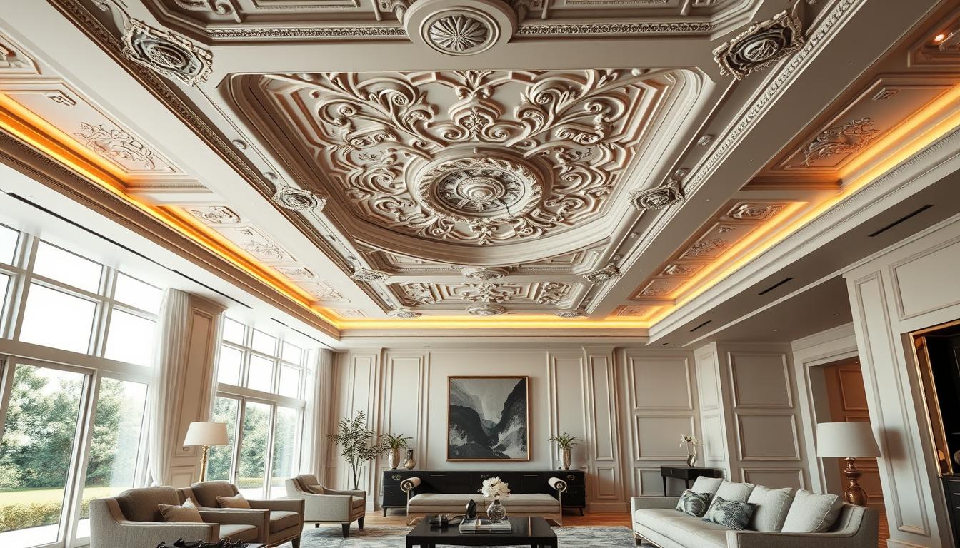
Understanding the Importance of Color in Home Interiors
Color plays a huge role in home interiors. It affects our feelings and how we see space. The colors we pick can change our mood, energy, and comfort at home.
The Psychology of Color
Colors deeply affect our mood. Blue hues bring calm and serenity, perfect for bedrooms. Vibrant yellows and oranges boost creativity and energy, great for offices or playrooms.
Color also changes how we see space. Light colors make rooms seem bigger. Dark shades create a cozy feel.
How Color Affects Mood and Space
Color greatly impacts our mood. Cool colors like greens and blues calm us down. Warm colors like reds and oranges bring energy but can be too much if overused.
Color also shapes how we see a room. Light walls make rooms feel bigger. Dark ceilings make spaces feel cozier.
Balancing Colors in Home Design
It’s key to balance colors in home design. Use a main color and add one or two secondary colors. This avoids too much color and creates a unified look.
Choosing the best interior paint for home means thinking about the color scheme. Neutral colors like beige, gray, and white are good for adding bold colors.
Knowing how color affects us helps us pick the right popular wall paint shades. This way, we create spaces that are beautiful, emotionally connected, and functional.
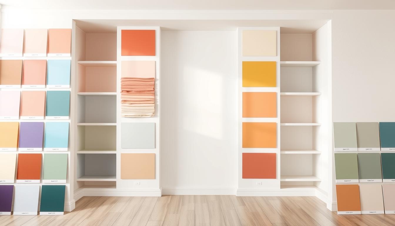
Trending Neutral Paint Colors for 2023
As we enter 2023, neutral paint colors are still top in home design. These colors provide a perfect base for your decor, letting you add color with furniture and accessories. Neutral colors are more than a trend; they’re a timeless choice that can make any room look better.
Shades of Gray: Modern Elegance
Gray is a favorite for a modern, elegant look. You can choose from light, soft grays to deep, charcoal ones. Using different shades of gray can make a room look sophisticated and balanced. You can also mix gray walls with white trim or bold furniture for a lively feel.
Timeless Whites and Creams
White and cream walls make rooms feel bigger and airier. These timeless colors are great for a clean, minimalist look. To add depth, mix different textures in furniture and decor. Warm cream tones can also make a room feel cozy.
The Warmth of Taupe and Beige
Taupe and beige bring warmth and comfort to any space. These neutral shades fit many decorating styles, from traditional to modern. Pairing these walls with natural wood furniture creates a welcoming atmosphere. For more ideas on colorful home interiors, check out our guide on designing vibrant and colorful home interiors.
Bold Accent Colors That Make a Statement
Bold accent colors add personality and flair to your home. Neutral colors are the base, but bold colors make your space stand out. We’ll look at how deep blues, vibrant greens, and rich reds can make a statement in your home.
Deep Blues for a Relaxed Feel
Deep blues are calming, perfect for bedrooms and living rooms. They bring a sense of peace, great for relaxing. Use deep blues as an accent wall or in throw pillows and blankets.
Here are some ways to use deep blues:
- Paint a single wall in a deep blue for a focal point
- Choose blue furniture and decor for depth
- Use blue glass or ceramics for decoration
Vibrant Greens for a Fresh Look
Vibrant greens add a lively feel to any room. Lime greens to emerald tones fit every style. They’re great in kitchens, dining areas, and bathrooms, bringing nature indoors.
Here’s how to use vibrant greens:
- Add green plants or a living wall for a natural touch
- Use green glass or ceramic tiles as a backsplash
- Green textiles like rugs and throw pillows can make a statement
Rich Reds and Their Impact
Rich reds are bold and dramatic, perfect for making a statement. They add warmth and energy, great for dining rooms and living areas.
Balance rich reds with neutrals to avoid overwhelming the space. Here are some tips:
- Use red in furniture or decor as an accent
- Paint one wall in a rich red for a bold statement
- Red accessories like vases and candles can add impact
By adding bold accent colors like deep blues, vibrant greens, and rich reds, you can make your home unique and inviting. It shows off your personal style.
Popular Color Palettes to Consider
Choosing the right color scheme is key to a harmonious home. A well-chosen color palette greatly affects your home’s look and feel. Let’s look at some popular color palettes to inspire your interior design.
Monochromatic Schemes
A monochromatic scheme uses different shades of one color. It creates a calm and cohesive atmosphere, perfect for bedrooms and living rooms. For example, using various shades of blue can make a room feel serene.
Benefits of Monochromatic Schemes:
- Create a sense of continuity
- Can make a room appear larger
- Simplifies the design process
Complementary Color Combinations
Complementary colors are pairs that are opposite each other on the color wheel. They add contrast and interest to your space. For instance, blue and orange or red and green can make a room lively.
Tips for Using Complementary Colors:
- Balance bold colors with neutral tones
- Use the 60-30-10 rule as a guideline
- Experiment with different shades and tints
Embracing the 60-30-10 Rule
The 60-30-10 rule is a simple way to balance colors. It suggests 60% of the room is a dominant color, 30% a secondary color, and 10% an accent color. This rule helps create a balanced and appealing color scheme.
| Color Percentage | Color Role | Example |
|---|---|---|
| 60% | Dominant Color | Soft Gray Walls |
| 30% | Secondary Color | White Furniture |
| 10% | Accent Color | Bright Yellow Decor |

By understanding and applying these color palettes, you can create a beautiful space that shows your style. Whether you like the simplicity of monochromatic schemes, the vibrancy of complementary colors, or the balance of the 60-30-10 rule, there’s a palette for you.
The Role of Finish in Paint Choices
The finish of your paint greatly affects the feel of your home. It changes how your living spaces look and feel.
You have many paint finish options, each with its own look. You can choose from matte, satin, glossy, and textured finishes. Knowing what each offers helps you pick the best one for you.
Matte vs. Satin: Which Is Best?
Matte finishes are flat and don’t reflect light. They’re great for covering up wall flaws but aren’t as tough as other finishes. Satin finishes, on the other hand, have a slight shine and last longer, making them good for busy areas.
- Matte Finish Benefits: Hides wall imperfections well, provides a modern look.
- Matte Finish Drawbacks: Less durable, difficult to clean.
- Satin Finish Benefits: More durable, easier to clean than matte finishes.
- Satin Finish Drawbacks: May show more brush strokes, not as flat as matte finishes.
Glossy Finishes for a Modern Touch
Glossy finishes are shiny and reflective. They’re tough and easy to clean, perfect for trim and doors. But, they can make wall flaws stand out.
The key benefits of glossy finishes include their durability and ease of maintenance.
Textured Paints for Added Dimension
Textured paints give walls a three-dimensional look. They’re great for hiding flaws and adding interest. But, they can be hard to fix if they get damaged.
- Choose a texture that complements your room’s décor.
- Consider the durability and maintenance needs of the textured paint.
- Test the paint on a small area before applying it to the entire wall.
Understanding paint finishes helps you choose the right one for your walls. Whether you prefer matte, satin, glossy, or textured, the right choice depends on your needs and taste.
Regional Preferences in Interior Colors
Exploring interior design shows how regional tastes shape our color choices. The U.S. has different areas, each with its own culture, environment, and history. These factors influence how people decorate their homes.
The U.S.’s varied landscapes lead to different color trends in each region. Let’s dive into some of these trends.
East Coast Trends: Classic and Timeless
The East Coast is famous for its historic homes and classic designs. This leads to a preference for timeless, elegant colors.
- Neutral shades like whites, creams, and grays are popular for their elegance and versatility.
- Rich wood tones and dark accents add depth and warmth to rooms.
- Soft blues and muted greens are common in coastal areas, inspired by the ocean and nature.
West Coast Styles: Bright and Airy
The West Coast is known for its relaxed vibe and love for natural light and outdoor spaces.
- Bright colors like whites, beiges, and soft pastels reflect light and make rooms feel open.
- Calming blues and greens, inspired by the ocean and nature, are also popular.
- Earth tones and natural materials add warmth and coziness, balancing the brightness.
Southern Inspirations: Warm and Welcoming
The South is famous for its hospitality and warm homes. The color trends in this region reflect this welcoming atmosphere.
- Warm neutrals like taupe, beige, and soft browns create a cozy feel.
- Rich, deep colors like burgundy and navy blue add depth and character.
- Soft yellows and creamy whites add warmth and elegance to traditional Southern homes.
Knowing these regional interior color trends helps homeowners and designers choose colors that reflect personal taste and local culture. By considering popular wall paint shades and regional tastes, we can create spaces that are both beautiful and meaningful.
Tips for Choosing the Right Color for Each Room
Choosing the right paint color for each room can be tough but rewarding. With so many options, it’s key to think about what makes each room special. This includes the mood and purpose of each space.
Factors to Consider for Different Spaces
Each room has its own role in your home. Bedrooms might need calming colors like soft blues or greens. On the other hand, a home office might do well with colors like yellows or oranges.
The room’s lighting, furniture, and decor also play a part. For example, a room with lots of natural light can handle deeper colors. But a room with less light might need lighter shades to stay bright.
Lighting and Its Effect on Color Perception
Lighting greatly affects how we see color. Natural light, artificial light, and the room’s direction all matter. A color might look great in a showroom but different in your living room.
Also, different light bulbs change how colors appear. Warm white bulbs make colors seem yellow, while cool white bulbs make them appear blue. We should think about our room’s lighting when picking a paint color.
How to Test Paint Colors Before Committing
Testing paint colors before a big change is wise. You can paint a small wall section or use samples. This lets you see how the color looks at different times and under different lights.
Online visualizers or apps can also help. They show how colors might look in your space. While not perfect, they’re a good starting point.
By considering these tips and testing colors, we can make smart choices. Whether we want a cozy room or a lively workspace, picking the right paint color is key. It helps us achieve our desired look and feel.
Sustainability in Paint Products
The environment is becoming a bigger concern, leading to a shift towards sustainable paint. More people want eco-friendly paint options. We’ll look at sustainable paints, their benefits, and how they make our homes healthier.
Eco-Friendly Paint Options
Eco-friendly paints use natural ingredients and harm the environment less. They don’t have harsh chemicals or toxins. This makes them a better choice for homes. Some top brands include:
- Farrow & Ball
- Benjamin Moore’s Natura
- Behr’s Premium Plus U270
These brands offer many colors and finishes. So, you can still look good while being green.

Low VOC and Zero VOC Benefits
VOCs are chemicals that release harmful fumes easily. Low VOC and Zero VOC paints cut down on these emissions. This improves the air inside our homes. The good things about these paints are:
| Benefits | Low VOC Paints | Zero VOC Paints |
|---|---|---|
| Reduced Indoor Air Pollution | Yes | Yes |
| Minimized Health Risks | Yes | Yes |
| Environmental Sustainability | Yes | Yes |
Dr. Jane Smith, an environmental health expert, says, “Choosing low VOC or zero VOC paints is a simple way to better air quality and health.”
The Rise of Natural Paints
Natural paints use clay, lime, and natural pigments. They’re good for the planet and add unique textures and looks. Natural paints are getting popular because of their:
- Sustainability
- Breathability
- Aesthetic appeal
“Natural paints bring a sense of warmth and character to a room, making them an excellent choice for those looking for a more authentic interior design experience.”
Choosing sustainable paints helps us reduce our environmental impact. It makes our homes healthier. As we become more eco-conscious, the importance of sustainable paints grows.
Conclusion: Embracing Our Color Choices
Color is key in making our homes special. The right colors can make our homes look better and feel welcoming. They show off our personal style.
Personal Style Reflection
Choosing popular paint colors is more than following trends. It’s about picking colors that show who we are. This way, our homes feel truly ours.
The Power of Color
Color can change how a room feels. Whether it’s calm neutrals or bright colors, our choices matter a lot. For the best results, think about the lighting and test colors before you decide.
Final Recommendations
When you start painting, know that the right color is waiting for you. With these tips, you can pick colors that show off your style. Your home will be a true reflection of you.