Did you know the right paint colors can change your living space? They can make it feel bigger, cozier, or more lively. Picking the right modern home interior paint colors is key to home decor. With so many choices, finding the perfect colors for your home interiors can be tough.
We’ll help you pick the best trendy paint colors for home interiors. You’ll learn how to create a color scheme that shows off your style. By checking out the latest trends and expert advice, you can turn your home into a place you’ll love.
Key Takeaways
- Understand the impact of color on your mood and space
- Explore the latest trends in modern home interior paint colors
- Learn expert tips for choosing the perfect color palette
- Create a cohesive look throughout your home
- Discover how to use color to enhance your home’s features
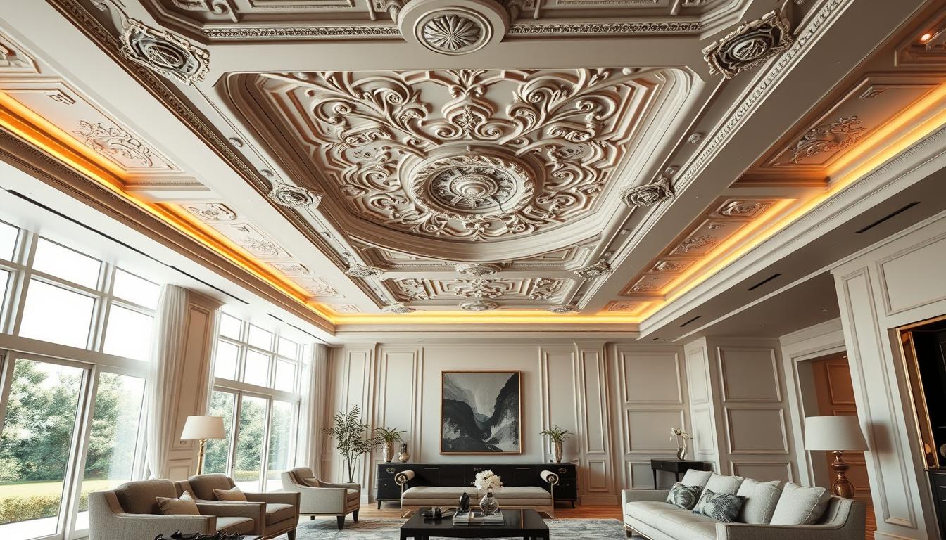
Understanding Modern Home Interior Design Trends
Knowing the latest trends in modern home interior design is key to a stylish, contemporary living space. Modern design is not just about looks. It’s also about making spaces functional and comfortable.
Key Characteristics of Modern Design
Modern home interior design has several key elements. These include:
- Minimalism: Focus on simplicity and clean lines.
- Functionality: Furniture and decor that have a purpose.
- Open Spaces: Open floor plans that encourage flow and interaction.
- Natural Light: Using natural light to brighten up spaces.
These elements together create a modern home that’s both beautiful and practical. When picking paint colors, think about how they’ll match these design features.
Popular Modern Design Styles
Several design styles are trending in modern home interiors. These include:
| Design Style | Description | Popular Colors |
|---|---|---|
| Scandinavian | Focuses on simplicity, functionality, and nature. | Neutrals, whites, and wood tones. |
| Industrial | Uses exposed brick, metal, and reclaimed wood. | Neutrals, grays, and earthy tones. |
| Mid-Century Modern | Known for organic shapes, clean lines, and a retro vibe. | Earth tones, bold colors for accents. |
Knowing these popular styles helps when picking popular interior paint color schemes and contemporary home wall paint ideas. They should match your modern home’s look.
Color Psychology in Interior Spaces
Colors can greatly affect our mood and well-being. They have the power to change how we feel, our energy levels, and our overall happiness.
The Impact of Colors on Mood
Different colors make us feel different ways. Warm colors like red, orange, and yellow make us feel energized. On the other hand, cool colors like blue, green, and purple calm us down. Knowing this can help you pick colors that match your mood and the feel you want in a room.
Here’s how some colors affect us:
- Red: It boosts energy and can make us talk more.
- Blue: It helps us relax and feel calm.
- Green: It balances our feelings and can help our eyes.
- Yellow: It makes us happier and can spark creativity.
Choosing Colors for Different Rooms
Each room has its own purpose, and the colors should match. For example, a bedroom should be calm, so use colors like light blue or pale green. A home office, on the other hand, might need colors like yellow or orange to keep you focused.
When picking colors for your home, remember:
- Think about what the room is for.
- Look at the natural light it gets.
- Consider the furniture and decor you’ll use.
- Try out the colors with a paint sample first.
By choosing colors wisely, you can make your home look stylish and support your well-being. This way, you’ll have stylish interior paint color trends and chic home interior color palettes that are both beautiful and beneficial.
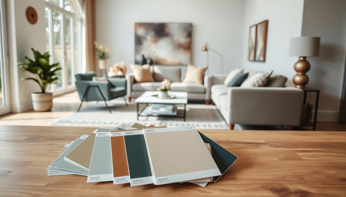
Top Modern Interior Paint Color Trends
Modern interior paint colors can change a room’s look. We’ll show you the latest trends. The world of interior design keeps changing. Knowing the current interior design color choices is key for a stylish home.
Earthy Tones and Neutrals
Earthy tones and neutrals are big in modern paint colors. They add warmth and calm, making a room cozy. Some top earthy tones are:
- Soft terracottas
- Muted greens
- Warm beiges
These colors fit many design styles, from simple to rustic. They pair well with bold pieces too.
Bold Colors for Accents
Neutrals set the calm base, but bold colors add personality. Trending bold colors include:
- Deep blues
- Rich emerald greens
- Vibrant yellows
Use these colors sparingly for a bold look. They can brighten a room or add interest.
Monochromatic Schemes
Many designers choose monochromatic color schemes for a sleek look. This means using different shades of one color in a room or house. It makes spaces feel bigger and more connected.
To pull off a monochromatic scheme, mix paint textures and finishes. This adds depth and interest.
Selecting the Right Paint Finish
Choosing the right paint finish is all about knowing the different types and how they affect color. The finish you pick can change how colors look on your walls. It’s a key part of getting the look you want for your home’s interior.
Types of Paint Finishes Explained
There are many paint finishes, from matte to high gloss. Each has its own look and use. Knowing these differences helps you pick the best finish for your space.
- Matte Finish: Great for places you don’t walk much, like ceilings. It’s flat and hides flaws well.
- Eggshell Finish: More durable than matte, it has a soft sheen. It’s good for living rooms and bedrooms.
- Satin Finish: It has a moderate sheen. This finish works well in busy areas like kitchens and hallways.
- Gloss Finish: Very shiny and durable. It’s best for trim and places that need a lot of cleaning.

Impact of Finish on Color Perception
The sheen of your paint changes how your home looks. A shiny finish makes colors pop, while a dull finish keeps them soft.
| Finish Type | Sheen Level | Effect on Color |
|---|---|---|
| Matte | Low | Muted, subtle color appearance |
| Satin | Medium | Balanced color vibrancy |
| Gloss | High | Vibrant, reflective color appearance |
By knowing what each finish does, you can pick the right sheen. This helps your colors shine in your home’s interior.
Creating a Cohesive Color Palette
Creating a unified color palette is key for modern home design. A good color scheme can make your home look better and feel welcoming. We’ll look at color harmony and how to mix colors well.
Understanding Color Harmony
Color harmony is when colors work together well. There are many ways to do this, like using complementary, analogous, or triadic colors. Complementary colors are opposite each other on the color wheel, making a striking contrast.
To get color harmony, think about the color wheel and how colors interact. Analogous colors are next to each other, creating a smooth look. Knowing these rules helps pick the right colors for your home.
Tips for Combining Colors
It’s important to mix colors well for a cohesive look. Here are some tips:
- Start with a neutral base and add accent colors for depth.
- Follow the 60-30-10 rule: 60% of a main color, 30% of a secondary, and 10% of an accent.
- Use different shades and tints of a color for a unified look.
| Color Scheme | Description | Example |
|---|---|---|
| Monochromatic | Using different shades of the same color | Various shades of blue |
| Complementary | Pairing colors opposite each other on the color wheel | Blue and orange |
| Analogous | Using colors next to each other on the color wheel | Blue, green, and yellow |
By understanding color harmony and using these tips, you can create a color palette that makes your modern home look great. Whether you use one color or many, a well-chosen color scheme can greatly improve your space’s feel.
Utilizing Light in Color Selection
To get the perfect color scheme, knowing how light impacts your colors is key. Lighting can change how colors look in your home. Some colors might seem brighter or duller, depending on the light.
How Natural Light Affects Color
Natural light changes color appearance in your home. Rooms with lots of sunlight can handle deeper colors. But rooms with little light might look better with lighter shades.
Think about your room’s orientation: North-facing rooms get softer, cooler light. South-facing rooms get bright, warm light. East and west rooms have different light effects, too.
Artificial Lighting Considerations
Artificial lighting also affects color appearance. Light bulbs come in different colors, from warm white to cool blue. Warm white lighting makes colors seem yellow or red. Cool blue light makes them seem blue or purple.
When picking artificial lighting, think about how it will mix with your paint colors. For example, deep blues or greens look cozy with warm white light. But cool light makes them pop.
Understanding light’s impact on color lets you pick paint that looks great all day. This way, your home’s walls will always look their best.
Paint Colors for Open Concept Spaces
Choosing the right paint colors is key to a beautiful open concept space. These areas are popular for their spacious and airy feel. They combine living, dining, and kitchen areas into one big space.
To get a cohesive look, it’s important to follow stylish interior paint color trends. These trends can make your home look better and feel more connected. The challenge is picking colors that work well together and keep the space open.
Strategies for Seamless Transitions
Planning is crucial for a smooth transition in open concept spaces. Using a unified color palette is a good strategy. This means picking a few core colors and using different shades or tints of them across the space.
- Choose a dominant color for most of the space.
- Use complementary colors for accents to add depth and interest.
- Follow the 60-30-10 rule: 60% for the dominant color, 30% for a secondary color, and 10% for an accent color.
Maintaining Color Balance in Open Areas
Color balance is key in open concept spaces to avoid a disjointed look. Think about the impact of lighting on your colors. Natural and artificial light can change how colors look at different times.
To keep balance, use color repetition in your space. This means using the same color in different things, like furniture, decor, or accessories. It helps create a sense of continuity.
Accent Walls: Making a Statement
Accent walls are a great way to show off your style and add elegance to your home. They can turn a room into a focal point, making it more interesting and deep.

In modern homes, accent walls really stand out. They work well with simple decor by adding a bold color to one wall. This creates a striking look that improves the room’s overall feel.
Choosing the Right Wall for an Accent
Picking the right wall for an accent is key. Look for a wall that naturally catches the eye, like one behind a fireplace or a staircase. Make sure the wall fits well with the room’s layout and furniture.
Think about the room’s natural light too. A wall with lots of natural light is perfect for an accent wall. It makes the color pop and adds warmth.
Tips for Effective Accent Wall Colors
Choosing the right color for your accent wall is exciting. For a stylish look, pick a color that matches your decor but also stands out. Cool colors like blues and greens can be calming, while bold colors like reds and oranges can energize the space.
- Follow the 60-30-10 rule: 60% of the room should be a main color, 30% a secondary color, and 10% an accent color.
- Choose a color that shows your personality and style.
- Try out the color with a paint sample before making a final choice.
By picking the right wall and color for your accent, you can make a beautiful focal point. It will enhance your home’s design and show off your unique taste.
Real-Life Inspiration: Successful Color Schemes
Let’s explore some real-life examples of great color schemes in modern homes. These examples will inspire you and offer practical tips for your own space. By looking at modern interiors, we can learn what makes a color scheme work.
Case Studies of Modern Interiors
We’ve picked some modern interior design projects with amazing color schemes. For example, a recent project used a bold monochromatic scheme for a cohesive look. Another project used earthy tones to add warmth and coziness to a simple space.
Analyzing Color Choices in Projects
When we look at these projects, we see several key factors. Natural light’s impact on color perception is one. Accent walls also play a big role in adding color and interest. For more stunning color schemes, check out our guide on Ryan Homes interior packages.
Common elements in these successful color schemes include:
- Thinking about the space’s purpose and how it will be used.
- Using a unifying color or element to connect different areas.
- Finding a balance between bold colors and neutral backgrounds.
By studying these examples and understanding the thought behind them, we can use these insights in our own projects. Whether it’s a single room or a whole home, the right color scheme can make your space stand out and show off your style.
Maintenance and Longevity of Paint Colors
Keeping your home’s interior paint colors looking good is key. Top modern shades can really change how your space feels. With the right care, your home will stay beautiful for many years.
Factors Affecting Paint Durability
Several things can make your paint wear out faster. Sunlight, moisture, and everyday use are big ones. Knowing these can help you protect your paint better.
Tips for Keeping Colors Fresh
To keep your colors bright, use high-quality paints. These should resist fading and cracking well. Also, clean your walls often and fix any damage right away. These steps will help your home stay looking great.